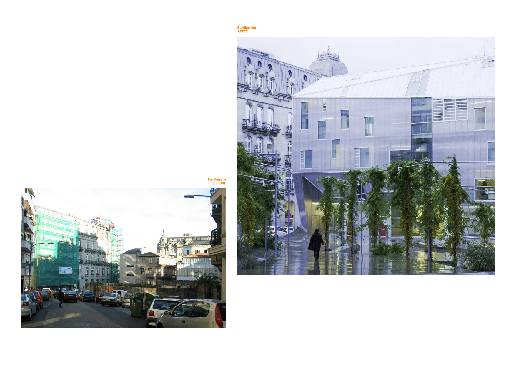
Previous state
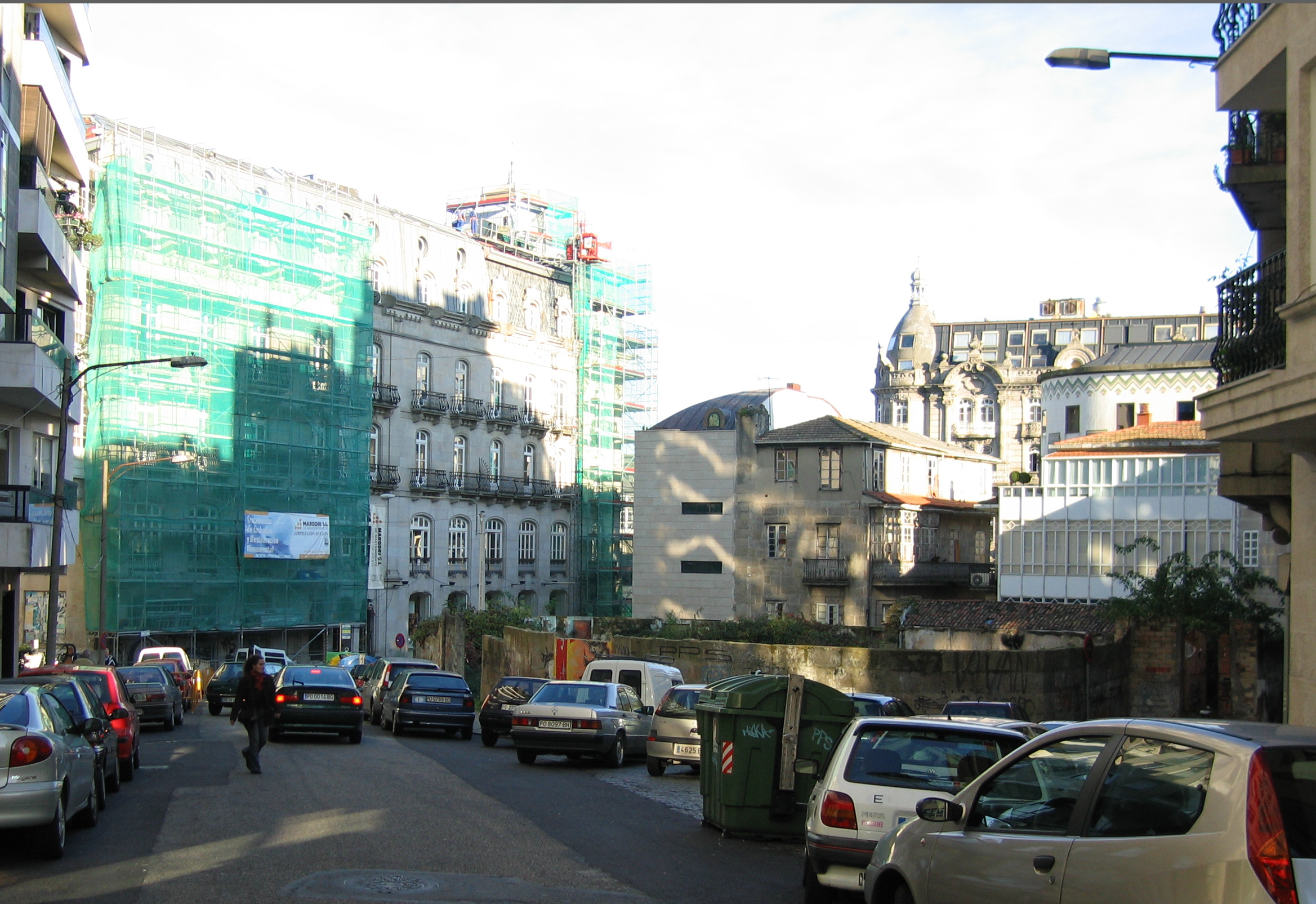
The demolition of the former building of El Pueblo Gallego, a historic newspaper that was closed down in 1979, opened up an unexpected space in the Casco Vello (Old City) of Vigo. Located next to the strange sculpture “O Sireno” (The Merman), which marks the nerve centre of the city, it is also surrounded by a very diverse range of buildings of different heights and periods, notable amongst which is the modernist, ostentatious and eclectic, “Simeon” department store dating from the beginning of the twentieth century. However, despite its central position, the richness of its setting and the confluence of several small streets spreading out from the empty space and thus promising the appearance of a square, the site remained mute, closed in by an opaque wall and haphazardly parked cars.Aim of the intervention
This situation dragged on for some years, until the City Council approved a plan that envisaged partial construction of the site with a service building and a vestibular space in the form of a square. Moreover, the Association of Galician Architects, a corporation formed under state law and professional centre for architects, saw here an opportunity for constructing its new headquarters in Vigo. Both entities came to agreement over a programme of needs and joined in announcing a public competition calling for entries in the form of designs for the new building and urban planning of the square. The new public space was to inherit the name of the old newspaper.Description
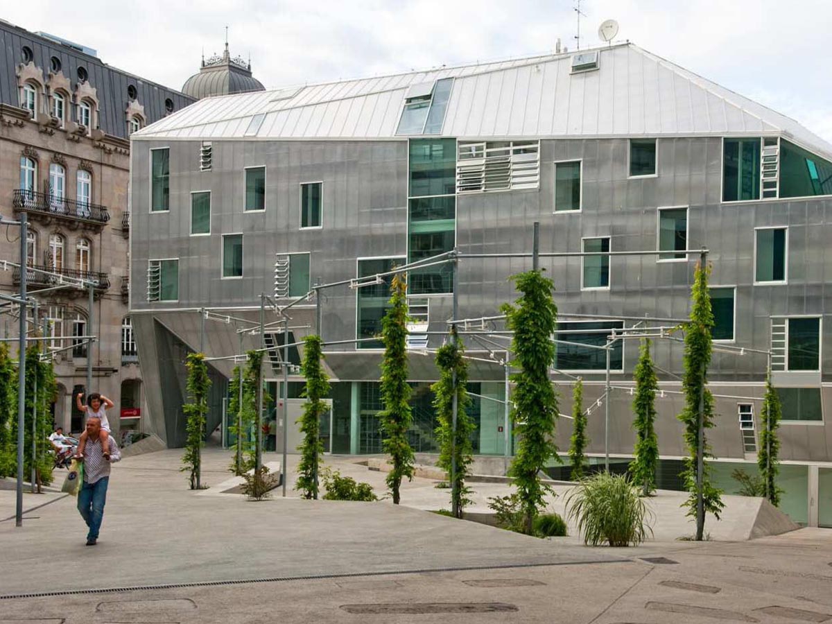
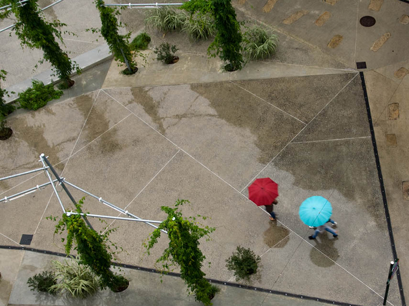
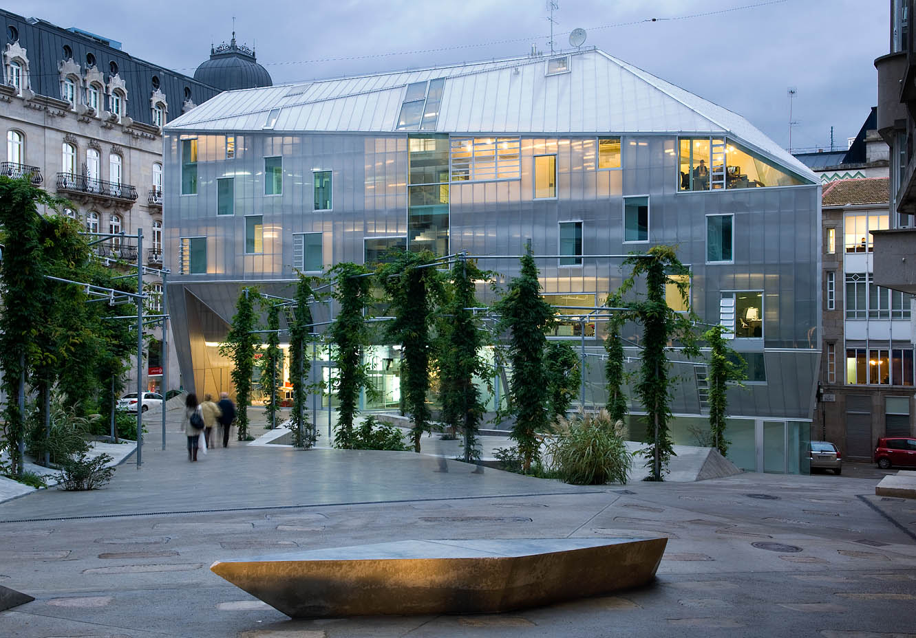
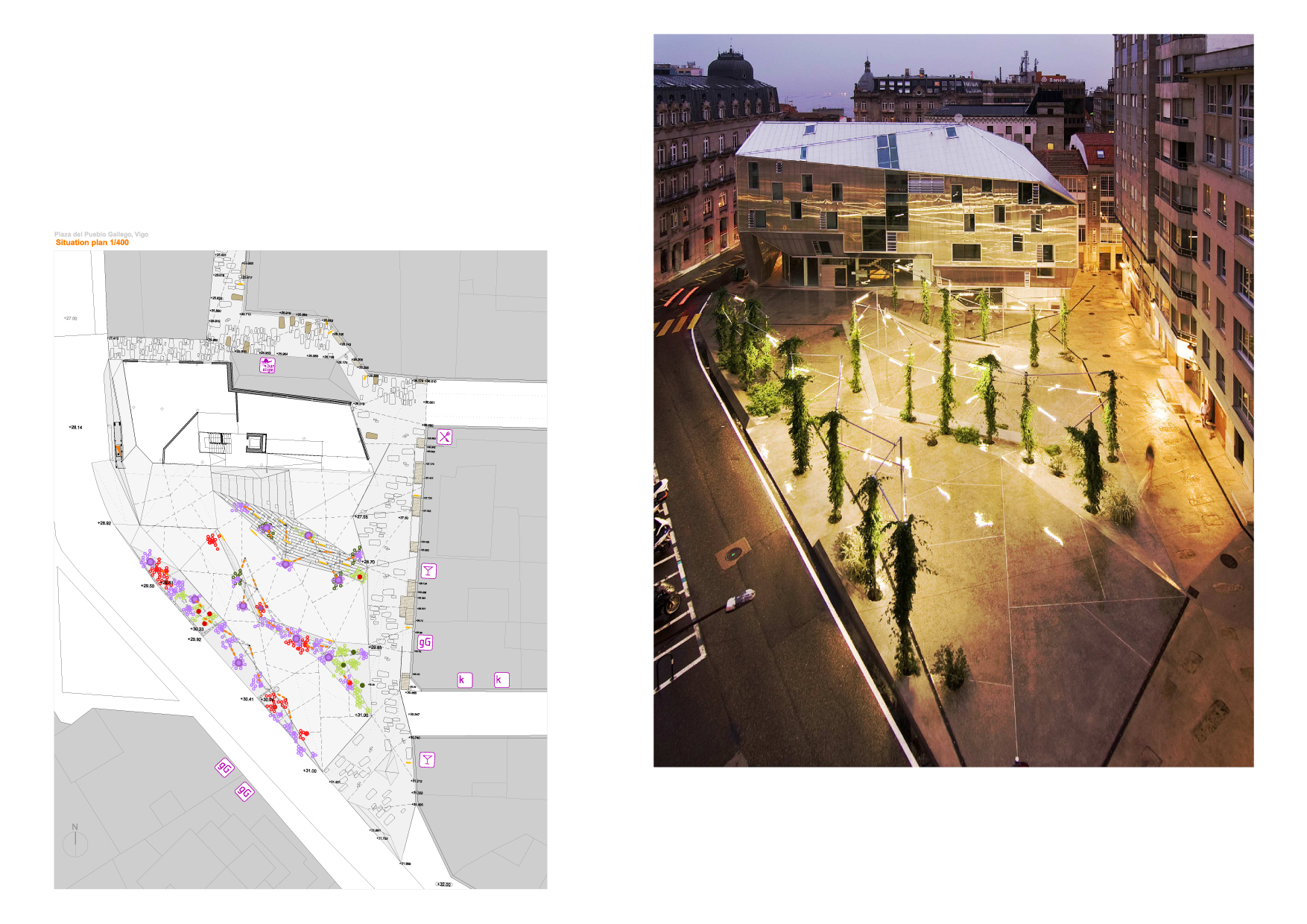
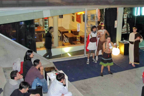
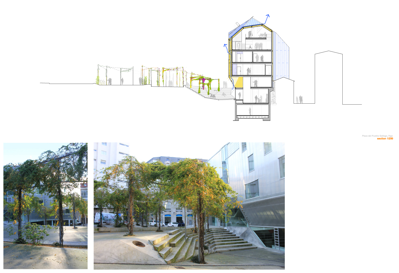
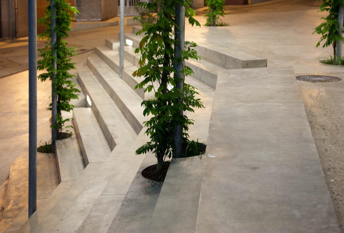
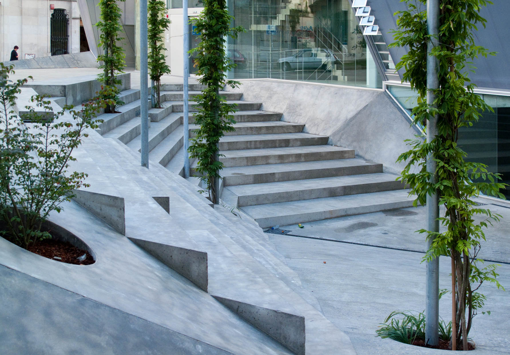
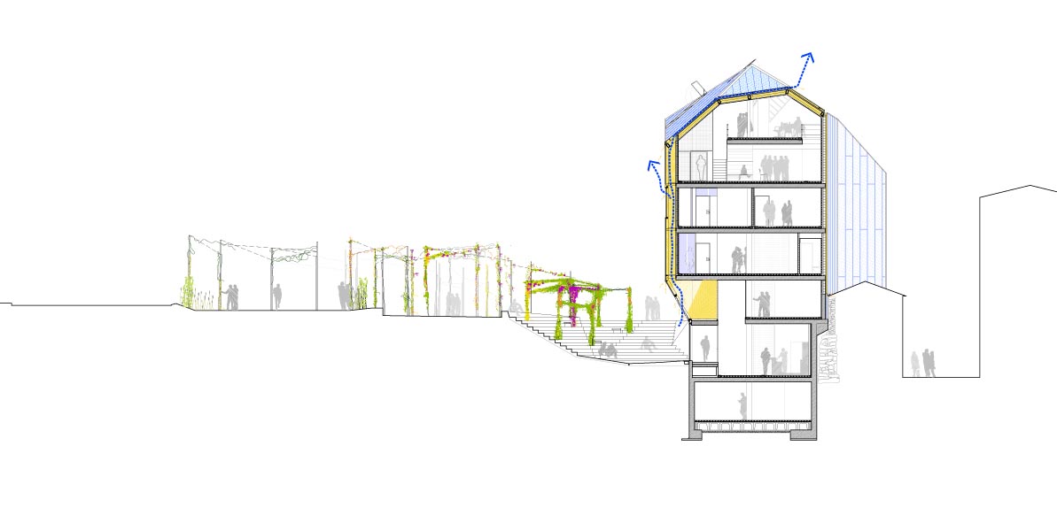
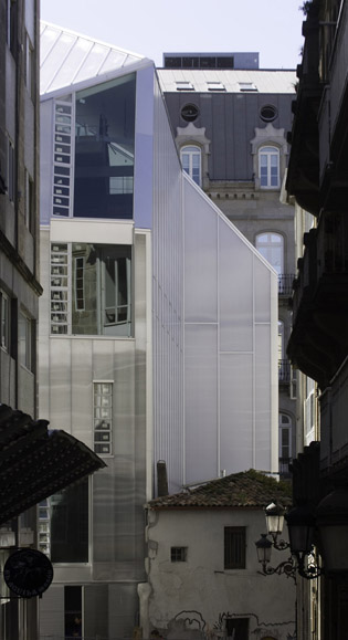
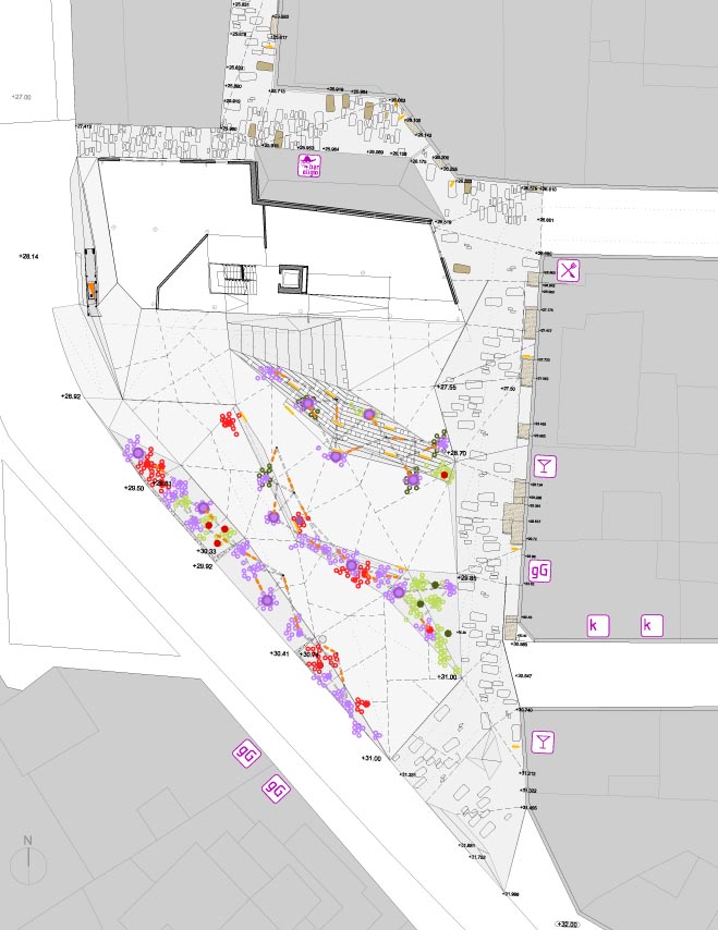
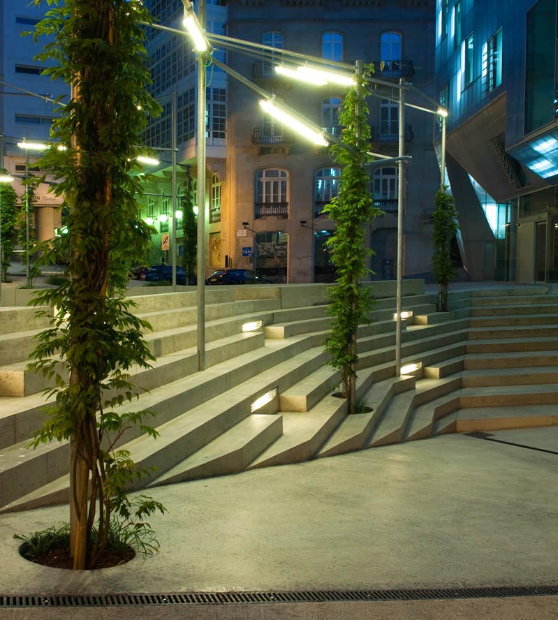
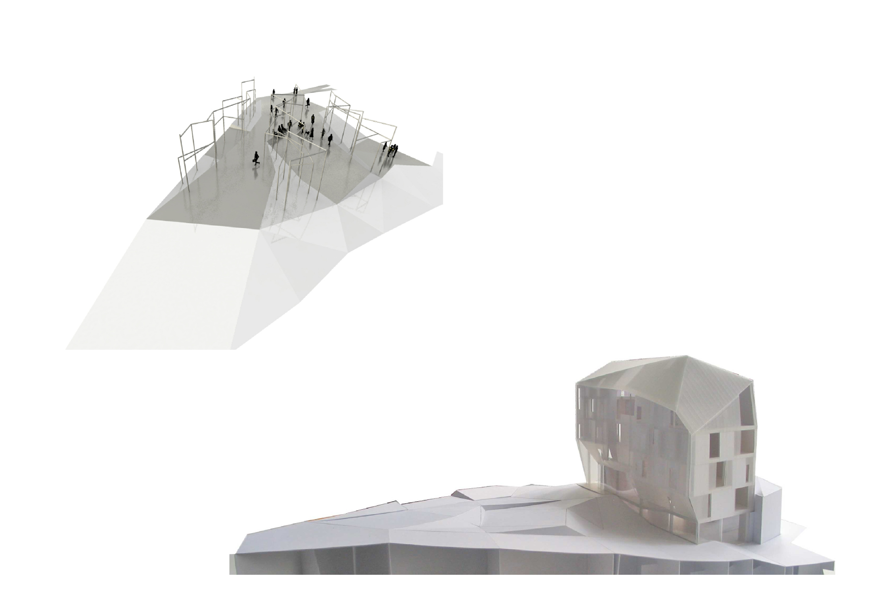
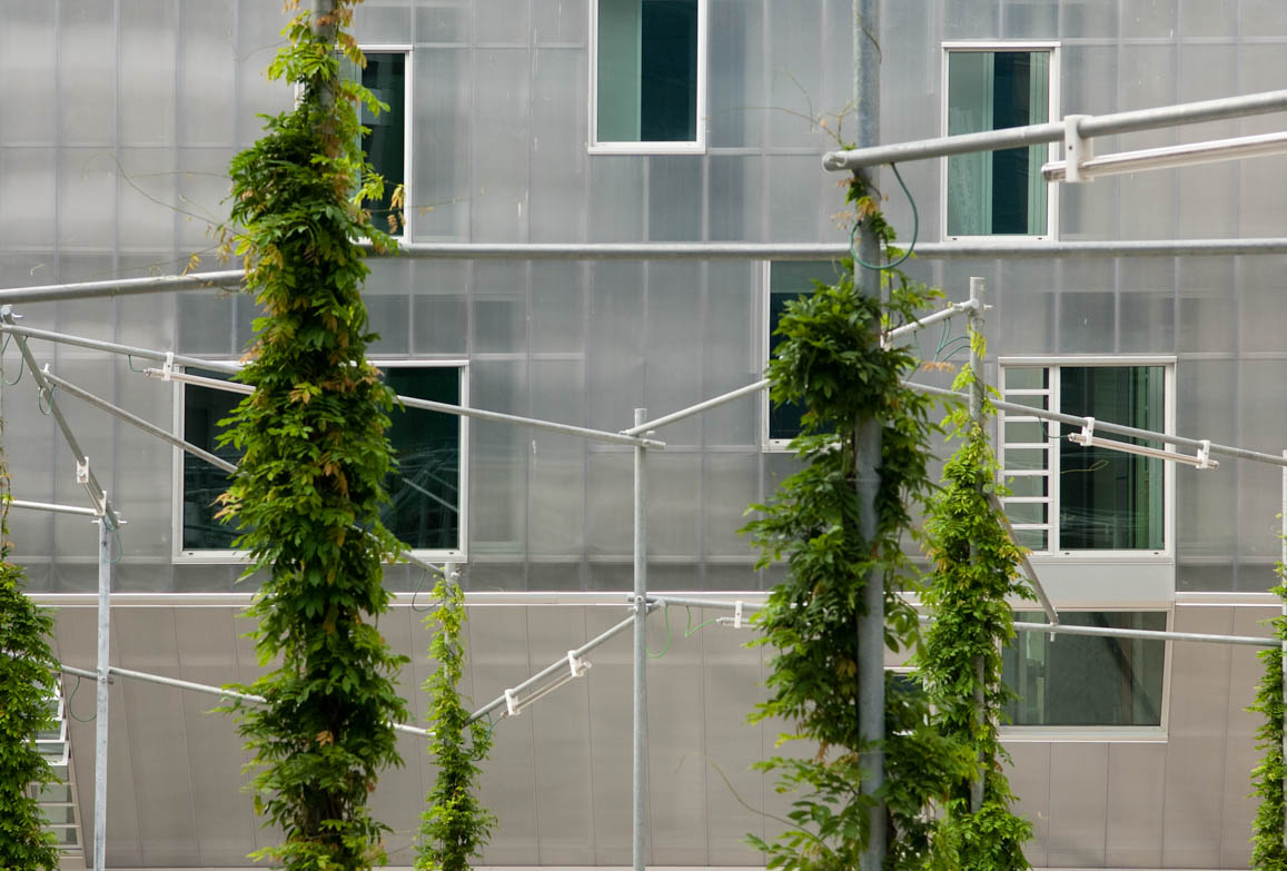
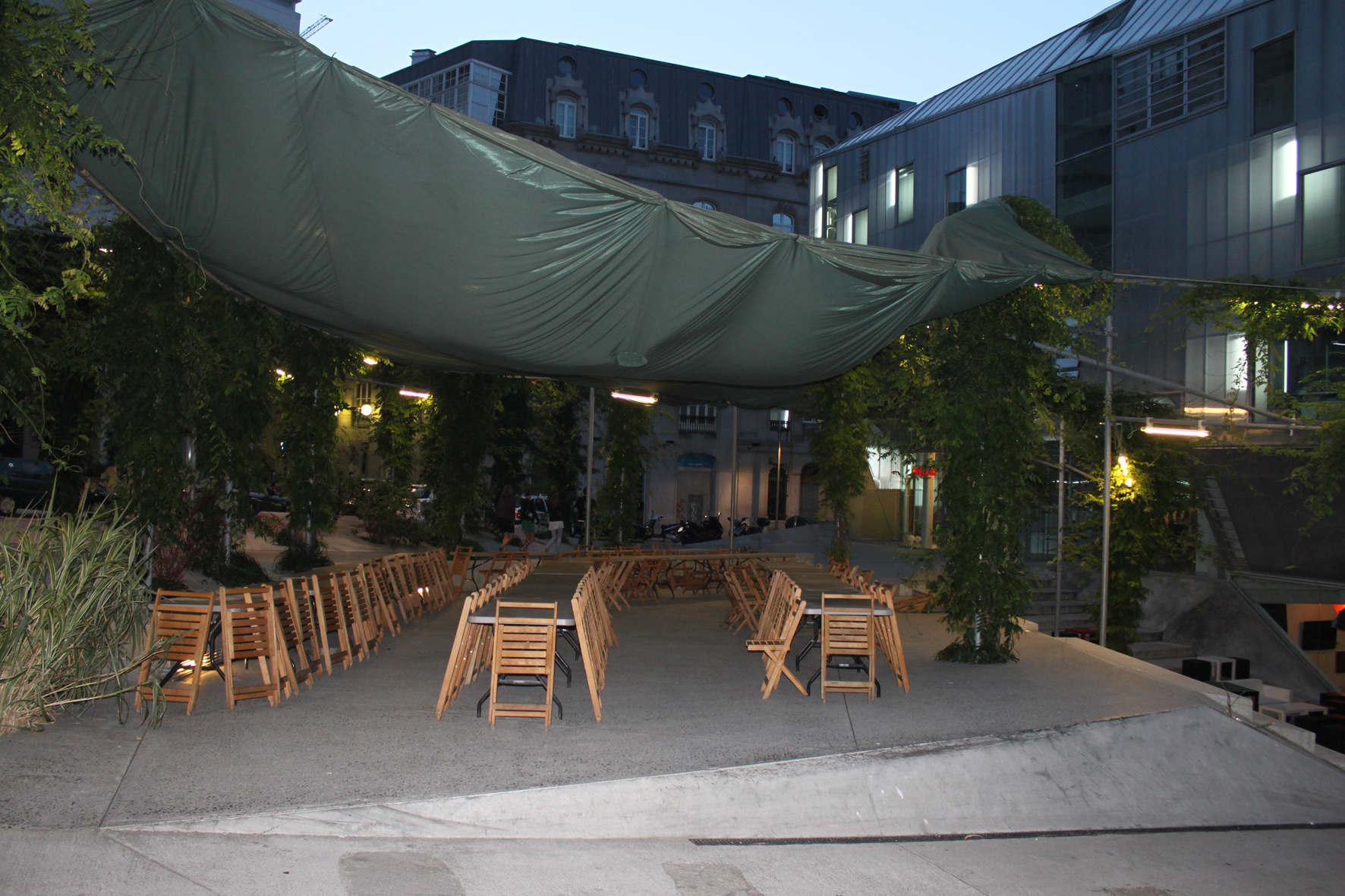
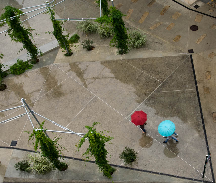
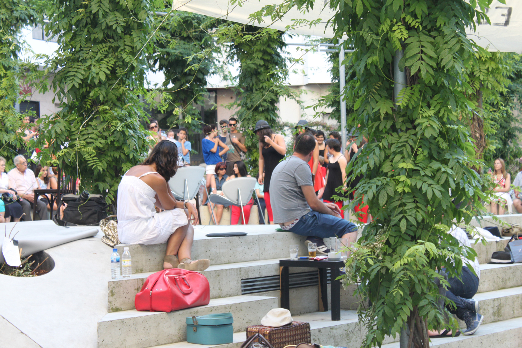
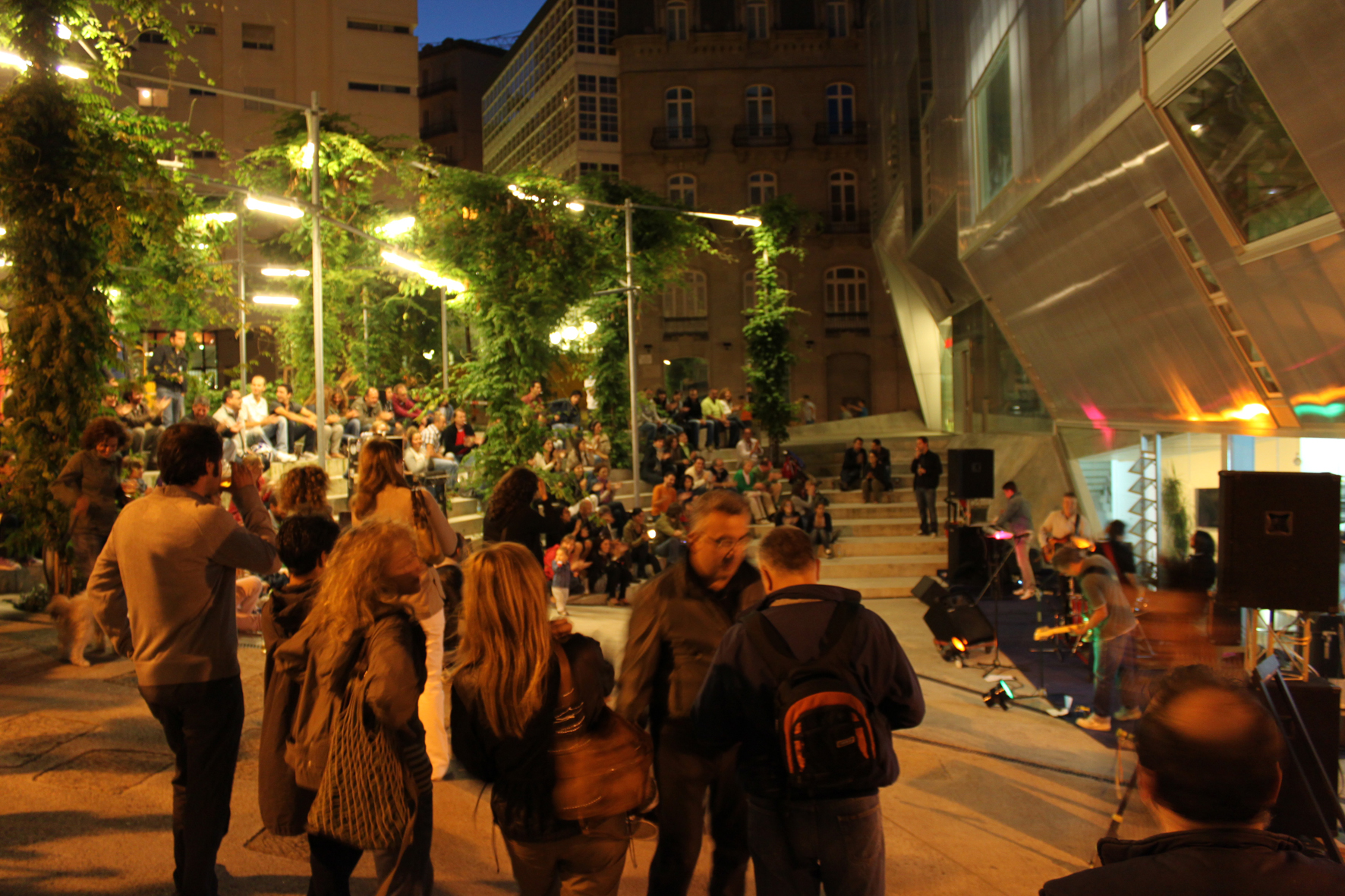
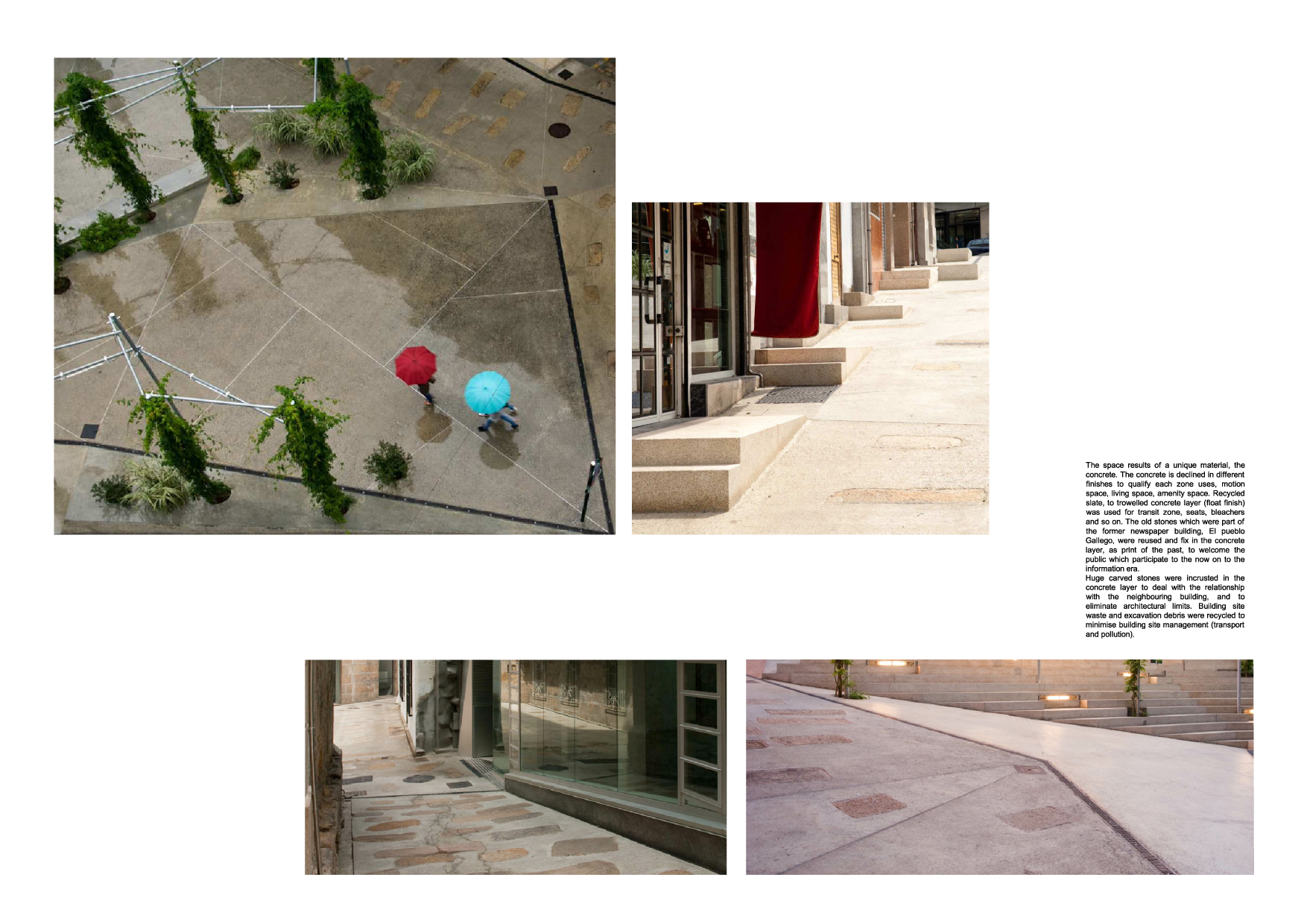
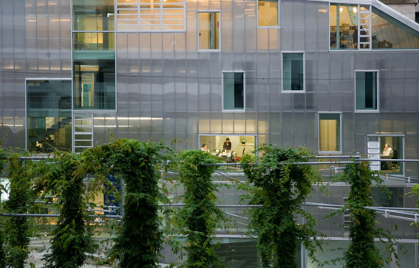
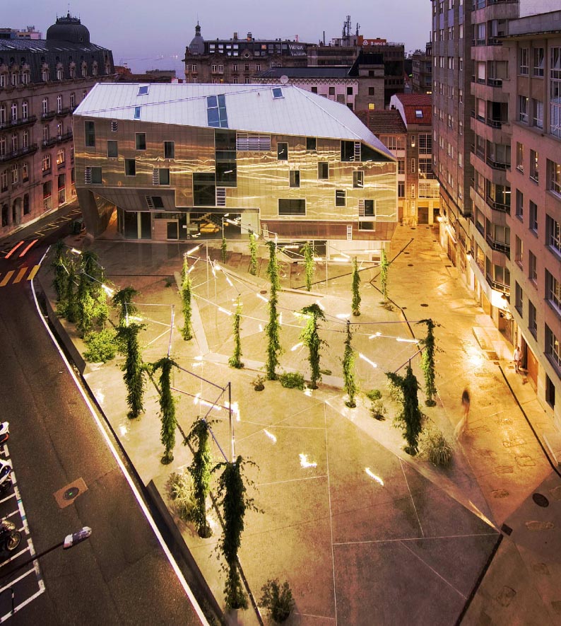
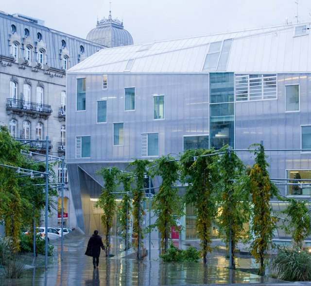
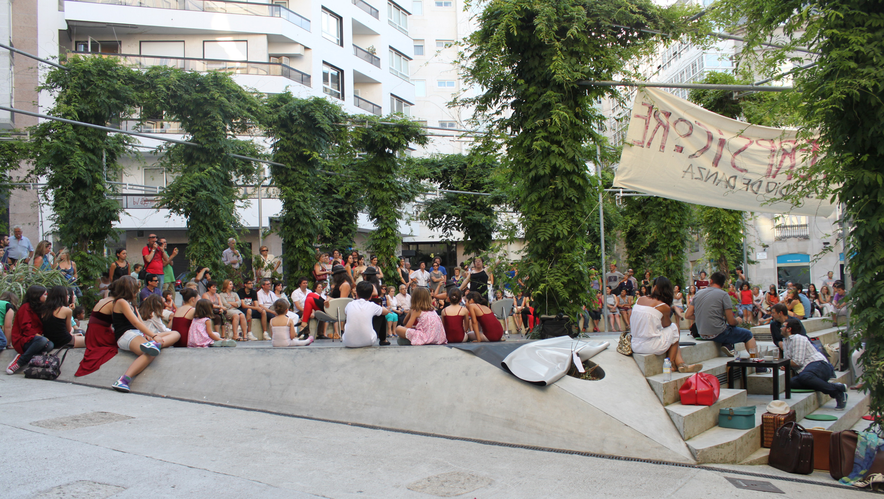
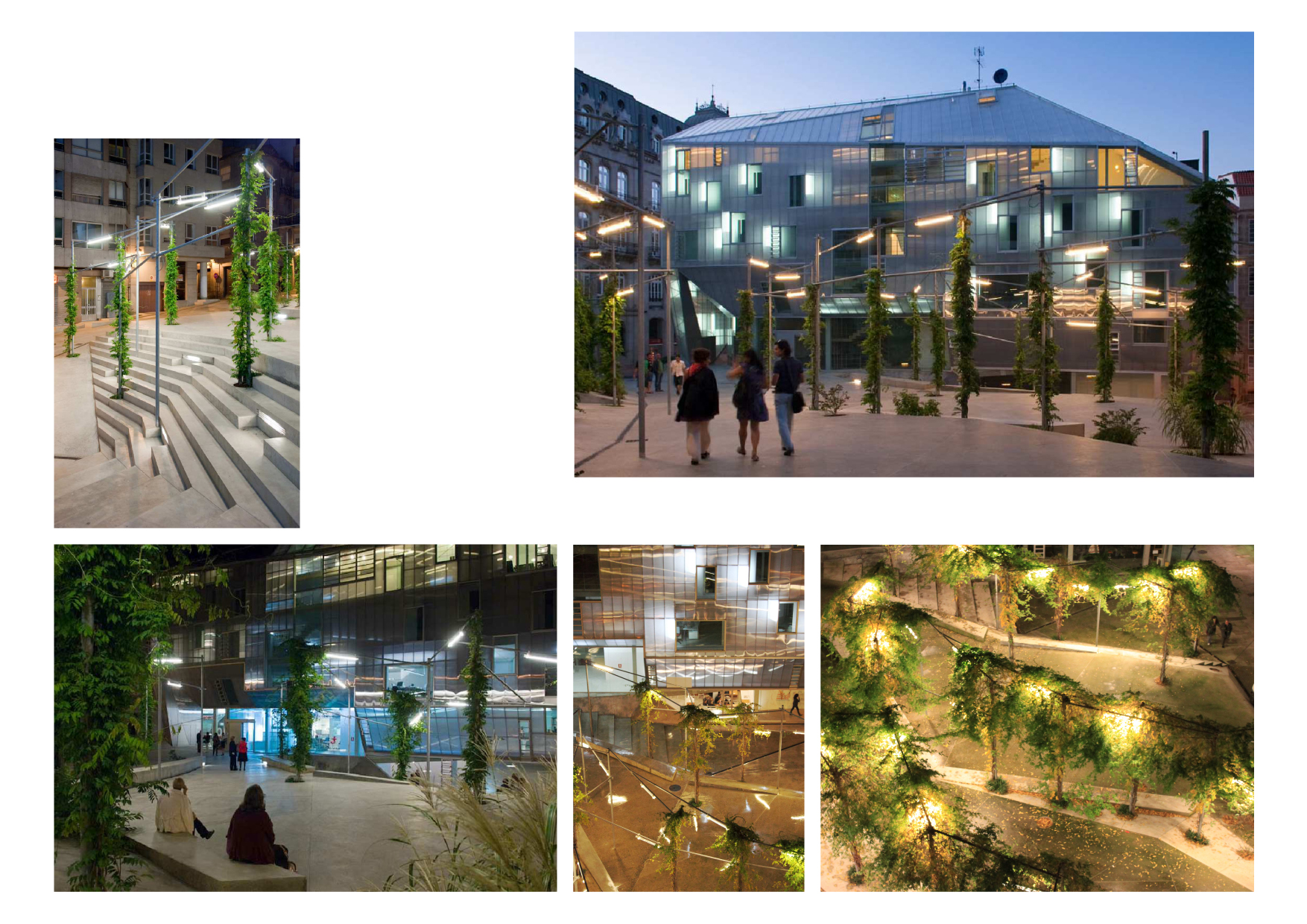
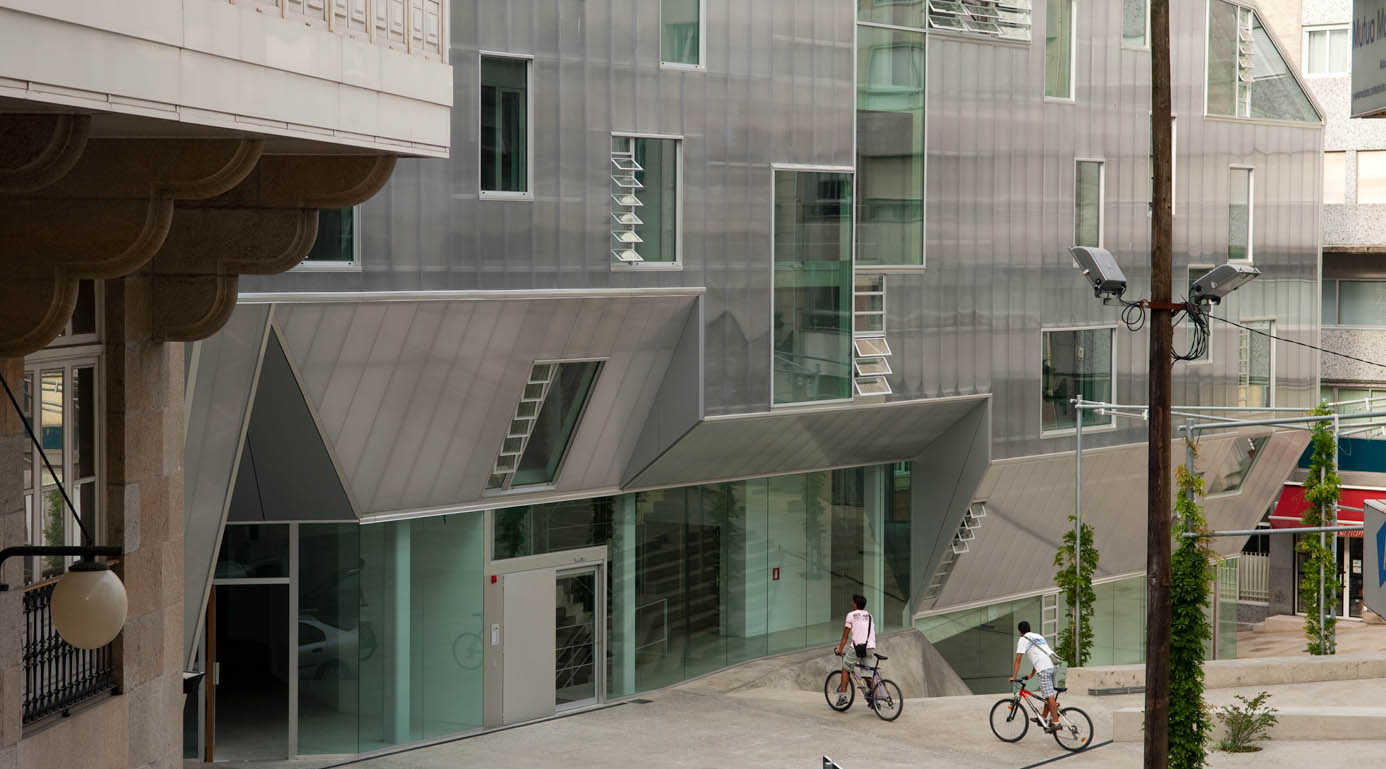
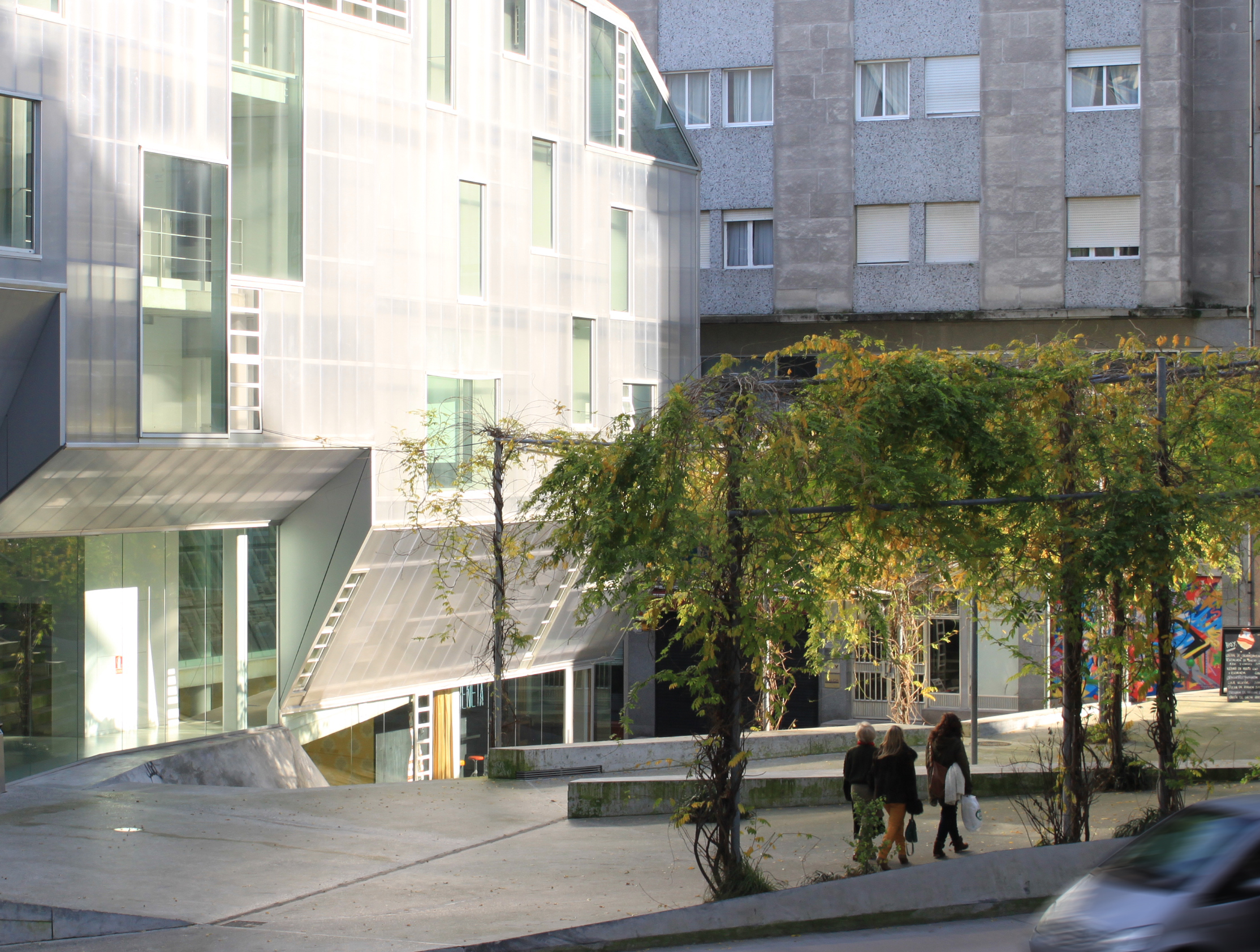
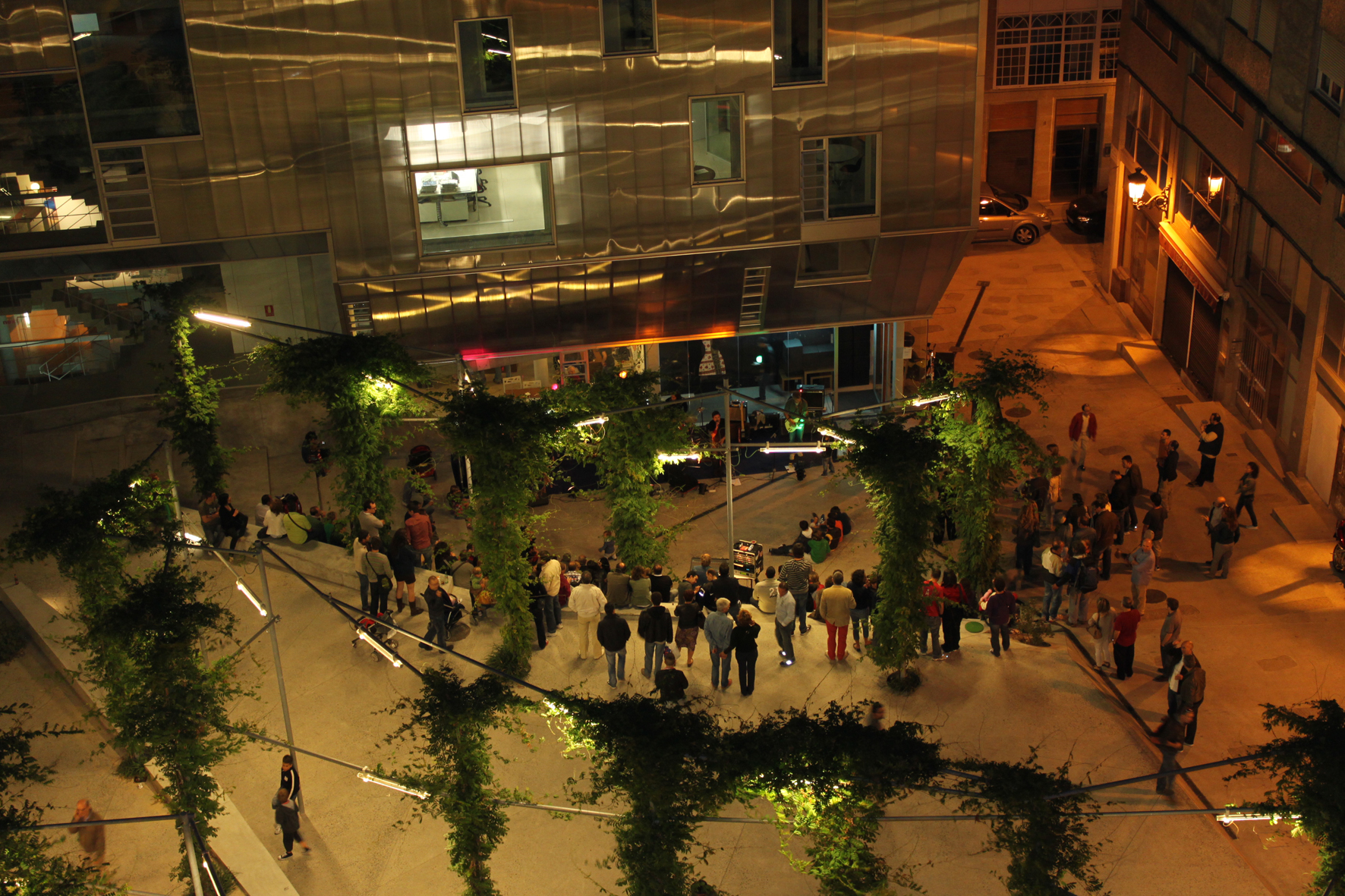
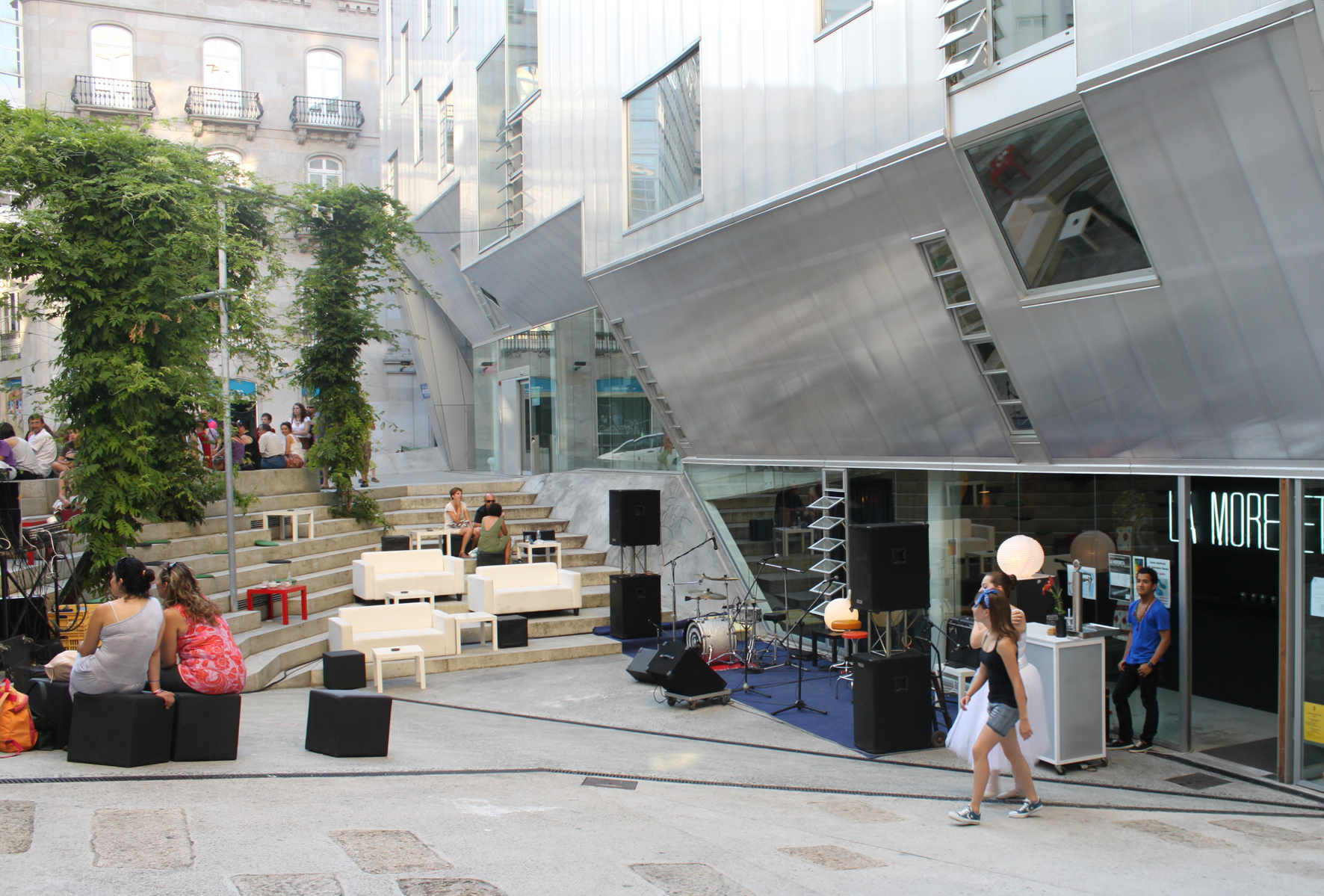
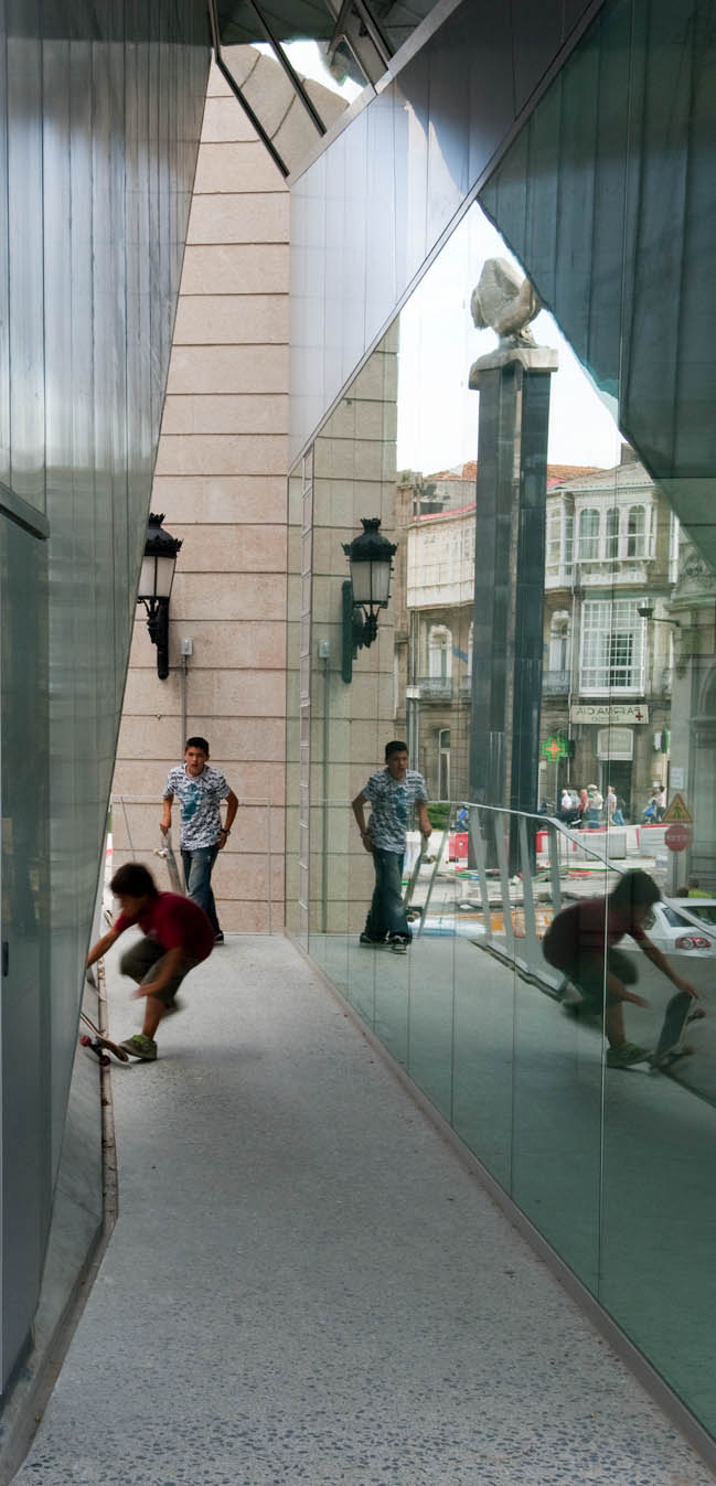
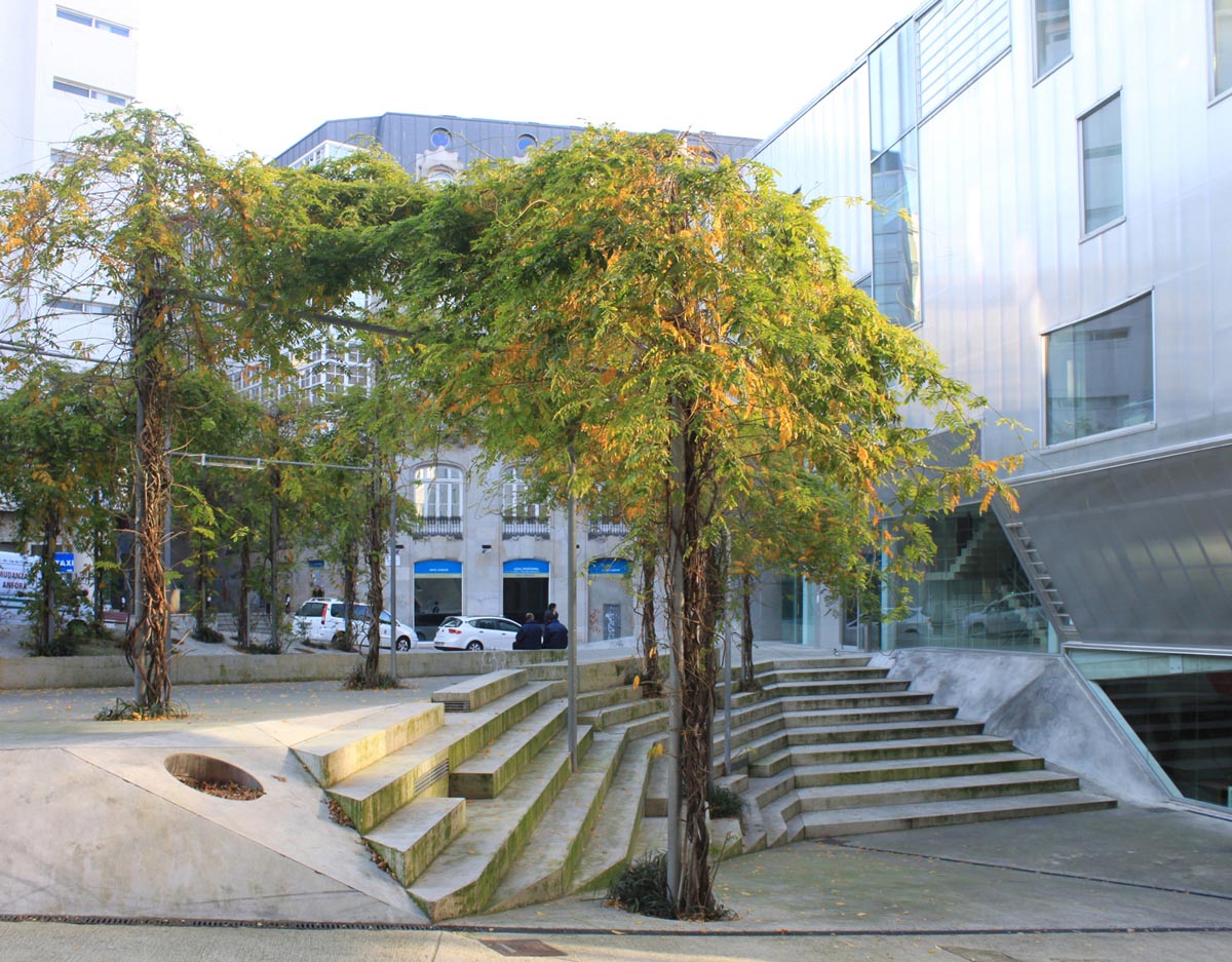
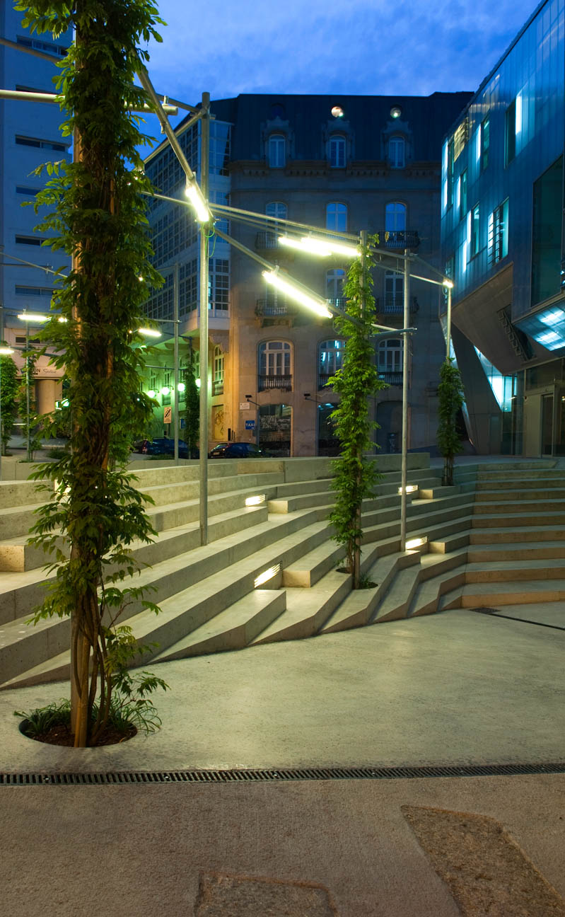
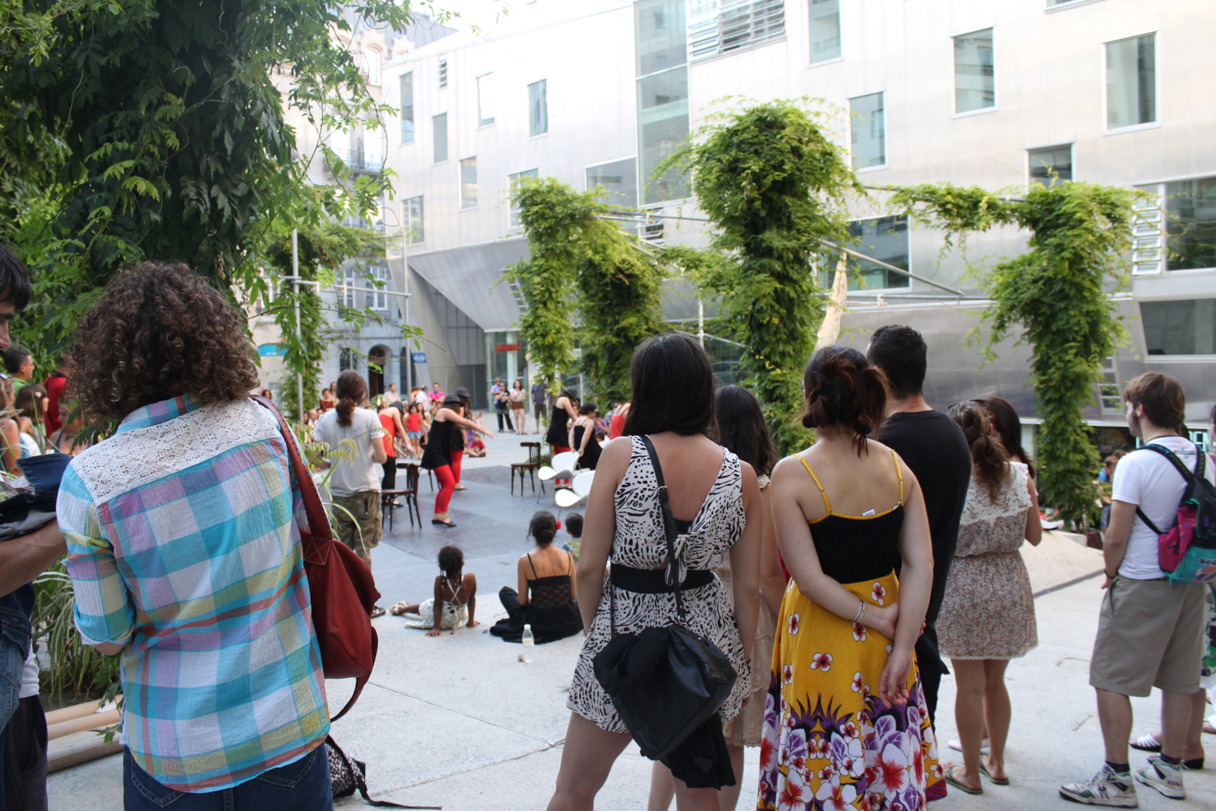
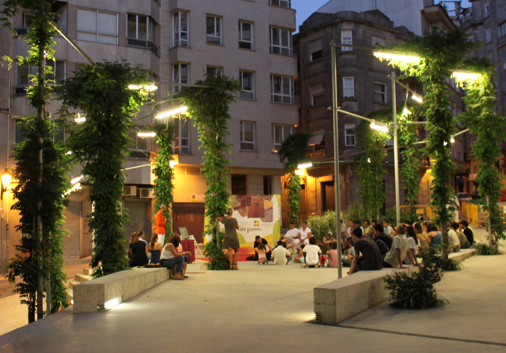
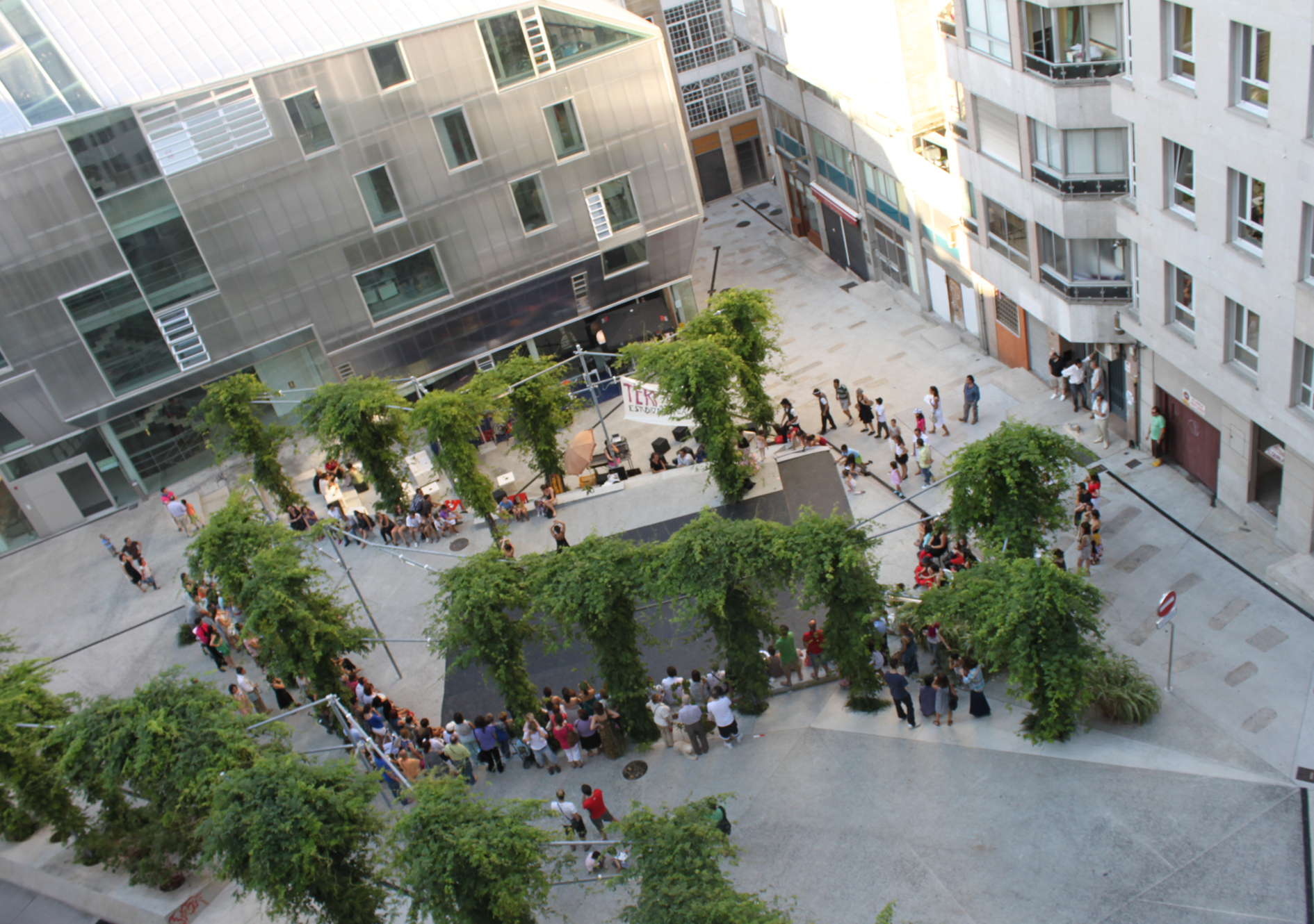
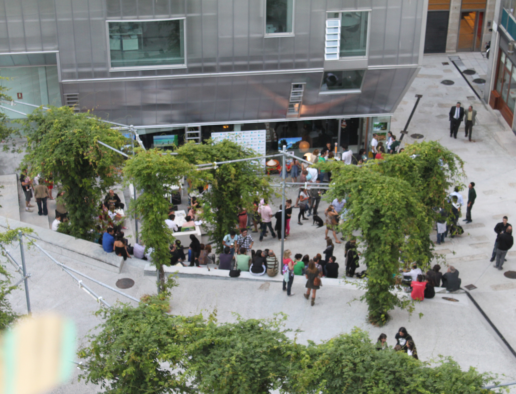
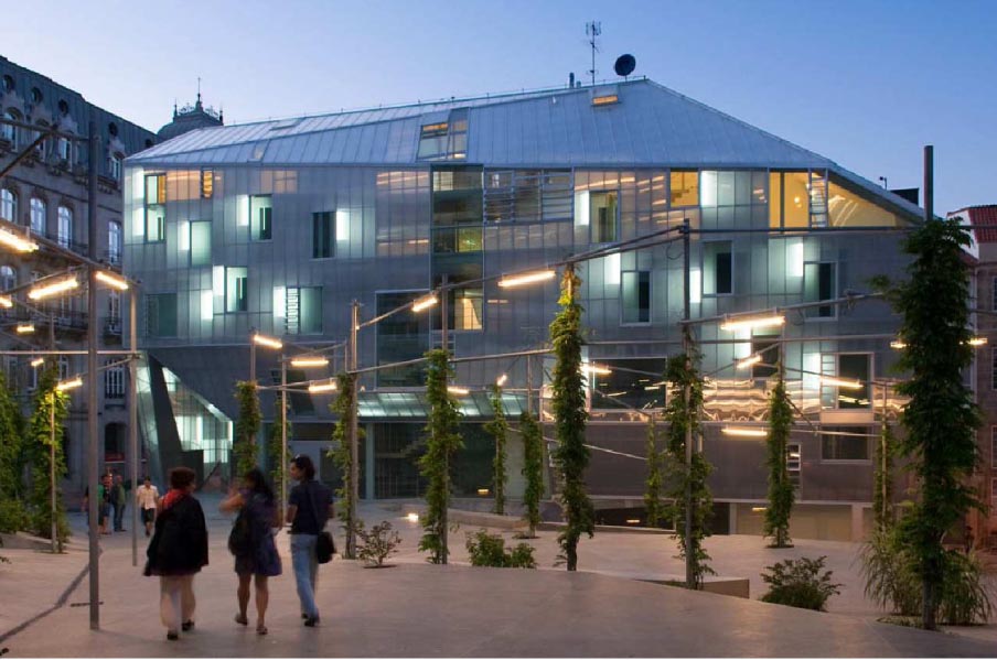
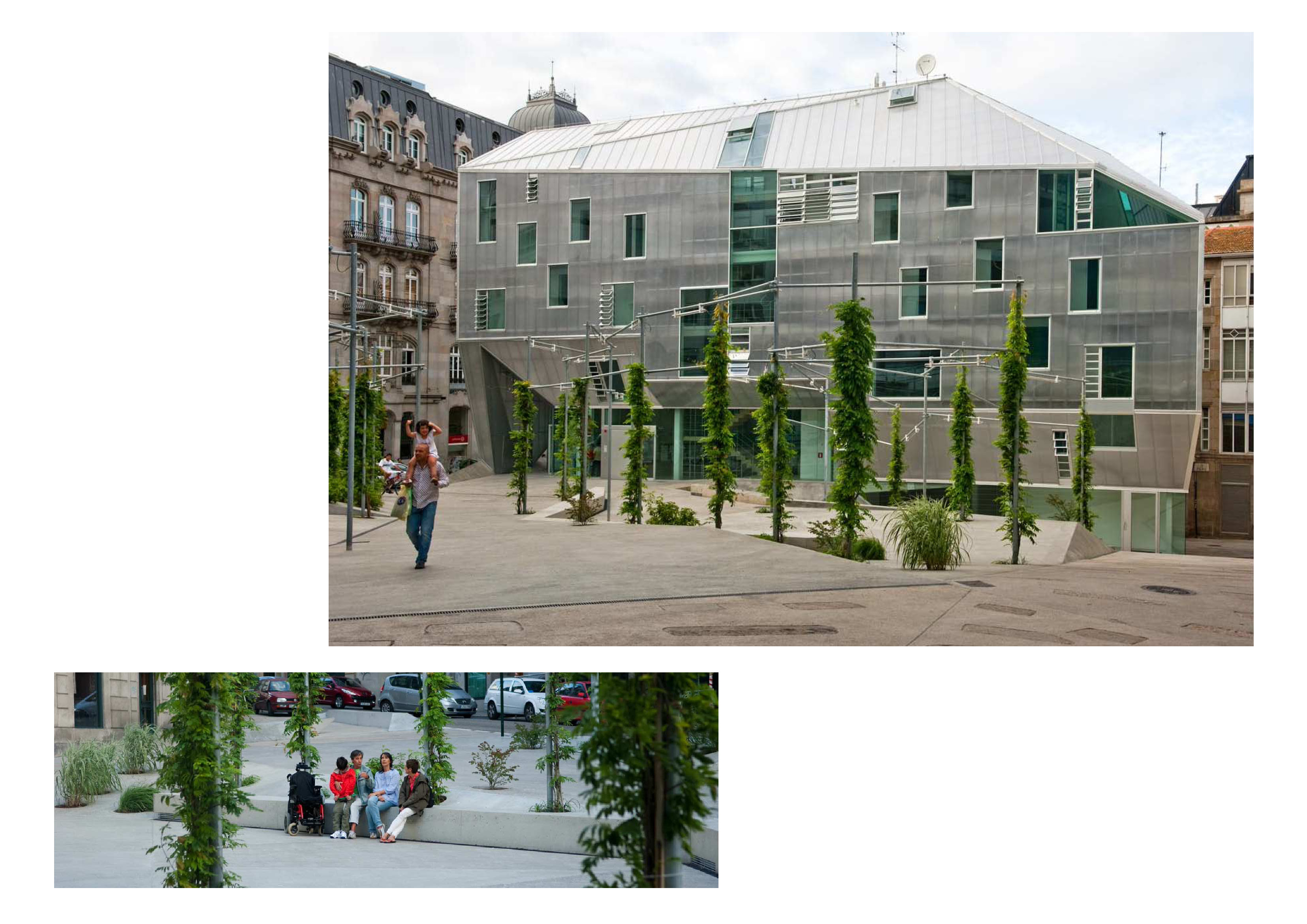
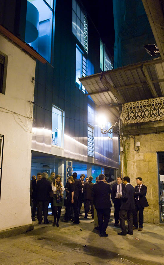
The main facade of the building and the square which now acts as its vestibular space have been conceived as a coherent, communicating dihedral. The former is covered with a translucent, ventilated membrane that reinterprets the tradition of the mansard in contemporary terms. Protection from the sun provided by this second skin means that the facade can be open to the square by means of large glass surfaces, even though it faces south. In addition, this combination of translucence and depth means that the appearance of the facade varies greatly in keeping with weather and light conditions. If, by day, it filters out the spaces behind it, appearing as a finish of independent composition, at night it dissolves to give a hazy impression of these spaces, filling the square with their light so that the effect is similar to that of a paper lantern.The square, in turn, looks towards the building. A drop of more than three metres, imposed by topography of the streets around the perimeter, has provided an excuse for folding down the flat concrete surface in order to form a small amphitheatre that embraces the main entrance to the Association. Its tiers and steps invite people to sit down and the space doubles as a venue for public functions, for example concerts or plays. Lights have been incrusted into the vertical plane of the steps and these illuminate both the ground and the facade. The concrete paving has been given a variety of finishes in order to define different spaces. In some of these areas, there are incrustations of pieces of slate and ashlars, which were recovered from the remains of the old newspaper building.
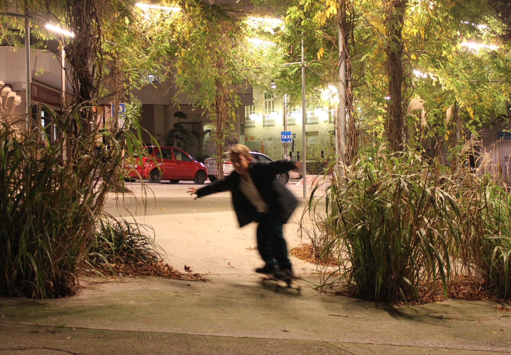
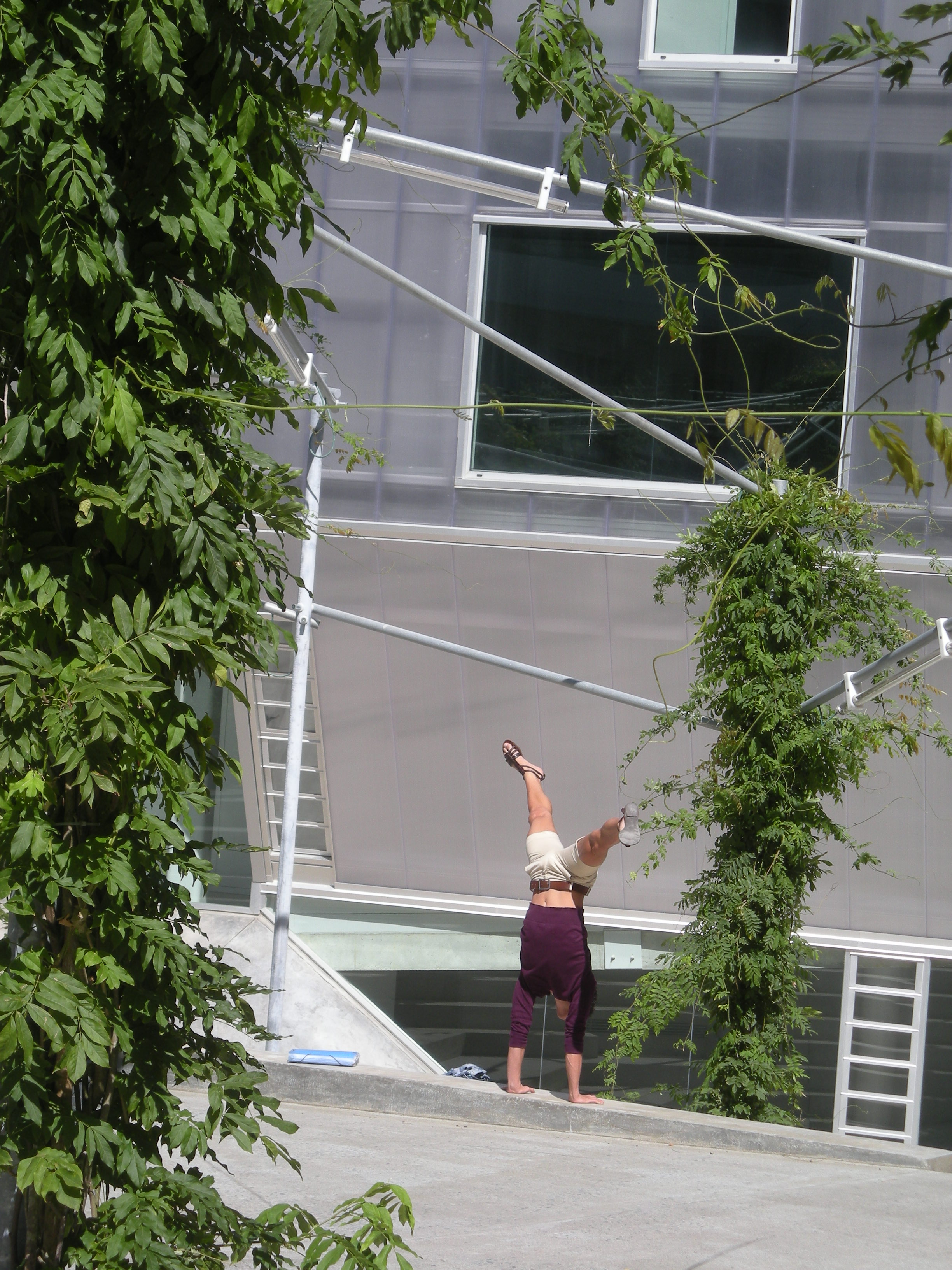
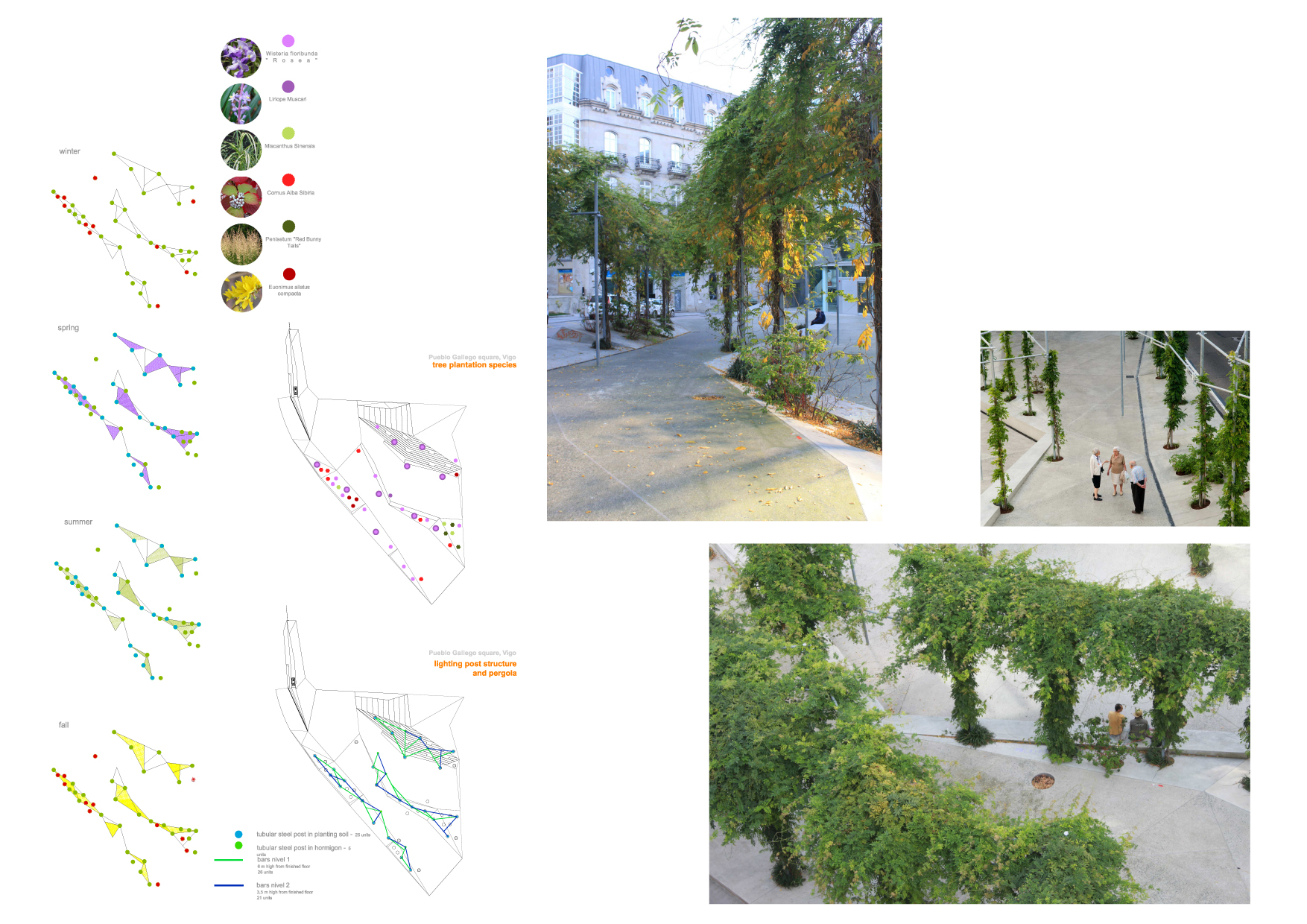
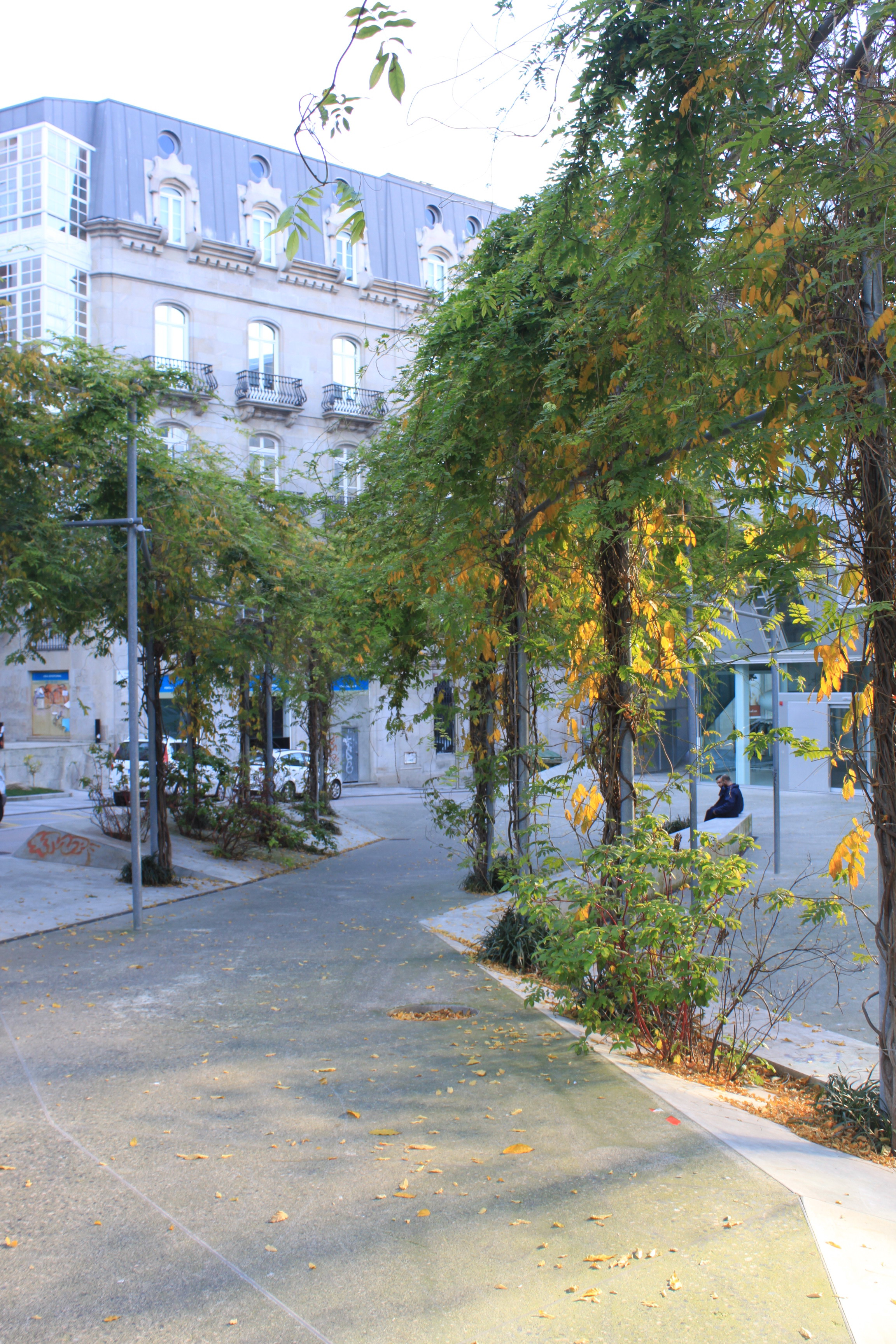
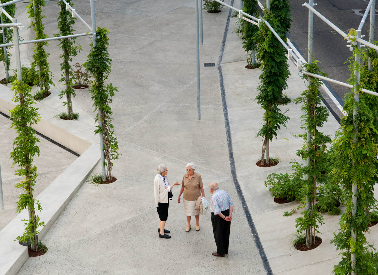
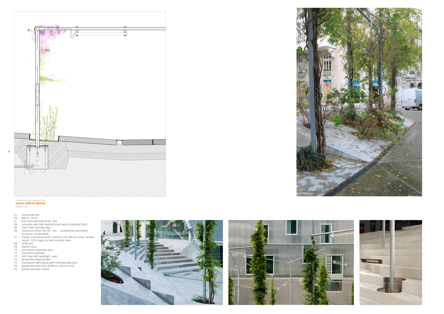
Here and there, whether the ground is flat or forms tiers or ramps, there are circular earth-filled garden plots that interrupt the spread of the concrete. In each of these is a vertical metal pole that is joined to others by means of horizontal crossbars, also made of metal. The resulting framed structure not only acts as a support for lighting but also for a green roof consisting of wisteria climbing from the garden plots. These deciduous vines, which provide shade in summer, let the sun through in winter and flower in spring, give great variety to the square as the seasons change. There are also other plants sharing the garden plots, for example the perennial grass miscanthus and liriope plants, together with the ornamental flowering shrub, red osier dogwood.
Assessment
As if turning over the page of a book, the intervention has enabled the surfaces of the square and the facade to exchange properties. In an interchange of folded planes, the identity of the old El Pueblo Gallego newspaper building has been projected on to the new area of public ground that has inherited its name and some of its materials. The levelling of the building has also revealed the identity of its successor, the new Architects’ Association, which is also mirrored in the ground of the square. Both horizontal and vertical planes are enriched by the dialogue, one echoing from the other by means of two good qualities. One of these is porosity, which allows the green cover of the square and the protective membrane of the building to mingle with shadows in seeking refreshment and gaining depth. The second is variability, fostered by the interaction of light and colours, reflections and transparencies, all of which keeps transforming the site’s appearance. As a result, porosity and variability have expanded, in both space and time, the threshold in which public space and private domains come together.David Bravo Bordas, architect
[Last update: 02/05/2018]


