Previous state
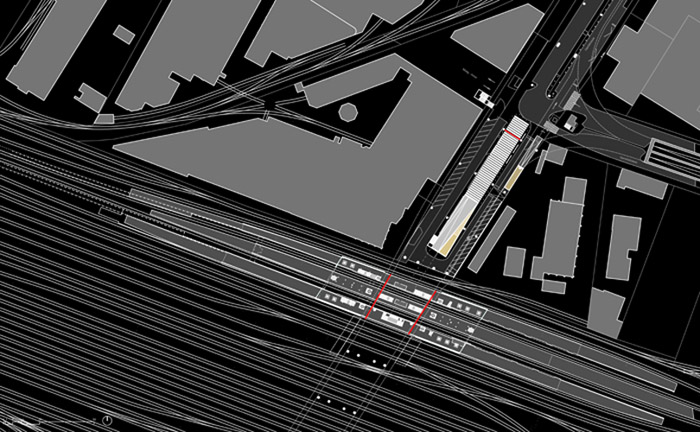
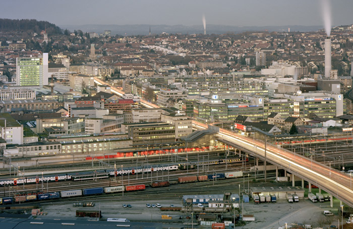
In the last ten years, the old industrial zone of Zurich, still known as the Industriequartier, has undergone a notable process of large-scale transformation which has brought into being a great number of public, residential and commercial buildings. Nowadays it comprises the city’s District 5, which is located between the River Limmat and the cluster of railway lines that run into the nearby Hauptbahnhof, Switzerland’s largest railway station and epicentre of railway transport in Zurich. One of the most remarkable points of interest of this transformation is the axis that is developing beneath the Hardbrücke, a raised bridge of more than a kilometre and a half in length that, crossing the river and the railway line, transversally divides the district. This axis runs from the Escher-Wyss Platz, near the river through to the metropolitan S-Bahn railway station, at the intersection of the bridge and the railway lines.
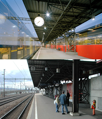
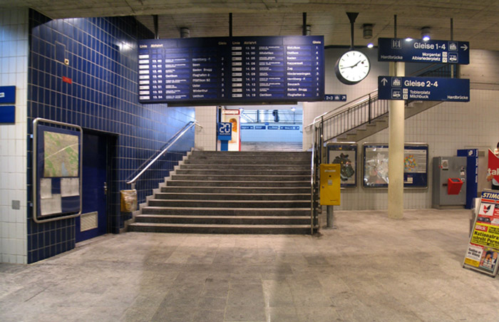
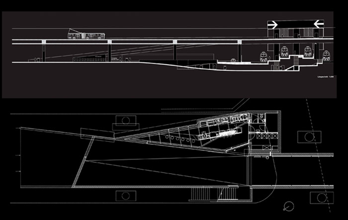
Opened in 1982, the Hardbrücke station is constructed on three superimposed levels. At upper pavement level of the bridge, over which runs a four-lane highway, there are bus lanes on either side with their corresponding bus stops. Each of these lanes is connected to lower street level with stairs and three lifts. At this level, the space covered by the Hardbrücke bridge slab and presided over by its great pillars, there are four railway tracks running perpendicular to the bridge. These are separated by three rather narrow platforms on to which the six lifts open directly. Below the tracks there is an underground passage connecting all the platforms transversally.
Until recently, the problems of the station were evident. For all its importance as a transport hub and the growing relevance of the neighbourhood, it could not compete with the urban presence of the bridge that covers it. It was imperceptible as an architectural object, both for the vehicles moving along the highway above it and for pedestrians in the lower streets and the Escher-Wyss Platz. Furthermore, its spaces were restricted and not very comfortable, while the routes for circulation and the signposting were unclear and offered little guidance.
Aim of the intervention
The Swiss Federal Railway public company SBB saw a chance to rectify these problems in the present-day situation of the transformation of the neighbourhood and, in particular, the envisaged construction of a police and judiciary complex near the station. It was thus decided in 2004 to allocate a fund of three million euros for the partial reform of the station. Besides improving its spaces to make them more cheerful and functional, the project aimed to transform it into an urban landmark that would signal a major entry point into the refurbished neighbourhood and even proclaim its new identity.
Description
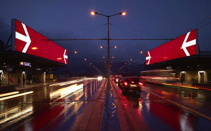
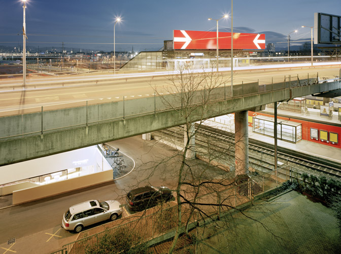
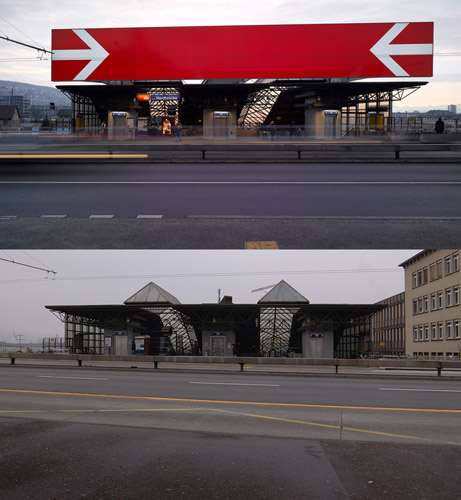
At the upper level of the highway, two large luminous panels of some three metres high and almost twenty-five metres long have been placed above the bus stop shelters. Each panel has two big white arrows, taken from the SBB logo, converging against a red background. Their colours, luminosity and dimensions, along with their elevated position above the Hardbrücke bridge, ensure that both panels are visible from a long way off.
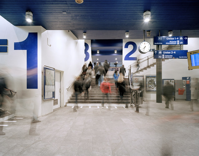
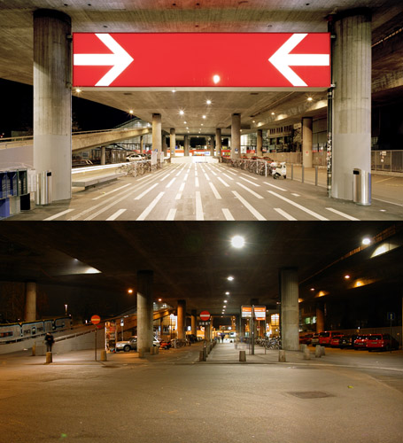
Below the slab of the bridge, the station spaces are now white, red and blue in keeping with the SBB tricolour corporate image. The long walls running the length of the platforms are red and the lift wells are blue. Although there was no solution to the narrowness of the platforms, the replacement of the former waiting areas with transparent glass boxes visually frees them of obstacles, making them seem wider. The displacement of the old parking area has freed a large space for pedestrians, highlighting the solemnity of the large porch of the vestibule, which is defined by the two rows of columns that support the slab of the bridge. Another large illuminated panel, set between two pillars, marks the vestibule entrance. With a red background and the same white arrows as on the upper panels, it is visible from the Escher-Wyss Platz at the far end of the porch. The functional distribution of the vestibule is now in harmony with the prevailing longitudinal direction dictated by the porch-arcade and reinforced with the lineal disposition of information panels, waste-paper bins, bicycle parking racks and the white strips in the paving. All these elements define a central passageway for pedestrians and segregate, beyond the two rows of pillars, two lateral lanes for vehicular transit.
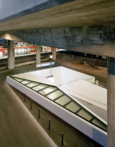
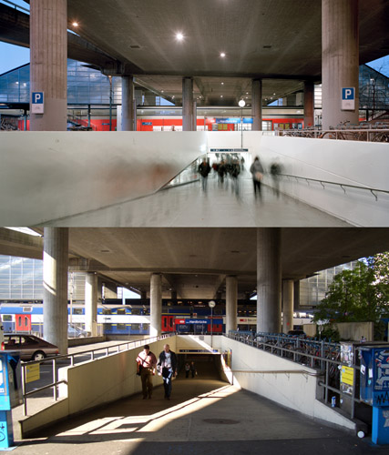
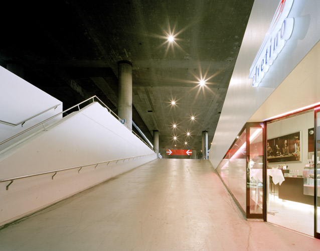
The central thoroughfare opens into a ramp leading down into the subterranean part of the station. This has been widened to improve the relationship between the vestibule and the lower floor. The ramp now houses a cafeteria covered with a skylight window. The introduction of this facility gives new life to the ramp, making it look more attractive, while the gradual widening visually foreshortens it in the upwards direction. The below-ground space has been tidied up and simplified. Now, the limits of the space are the supports of the information showing directions, once again based on the tricolour image of SBB. This has made it possible to remove accessory elements, to widen thoroughfare zones and to refine the visual appearance of the spaces by means of light and the systematic use of blue, red and white.
Assessment
The overwhelming presence of the Hardbrücke bridge and its impact within the Industriequartier cityscape arose from the need for a highway to circumvent the physical barrier of the railway lines. The opening of the station enabled a functional connection between two different systems of transport that, until then, were mutually detached. It also meant that the two forms of infrastructure would cease to be impermeable with regard to the urban fabric and that their intersection would constitute a major point of entry into the neighbourhood. Their physically coming together was thus consistent with the functional intersection of the two kinds of infrastructure with the surrounding neighbourhood. This correspondence, however, was not made explicit until the station was reformed.
Given the considerable importance of both forms of infrastructure, the station building was relatively insignificant. It has been necessary to give it meaning in order to make its specificity clear. A layer of information has been superimposed on the connection of form and function and, as is usual in railway stations, it has been offered using the support of luminous panels. In this case, however, the panels have gone beyond mere functionality to become architectural elements on the urban scale. The two lit-up panels on the upper roadway of the bridge rise up either side like the two jambs of a huge entranceway. Similarly, the panel in the vestibule hangs between two pillars like a great lintel indicating access to a space of transit. Exceeding the usual scale, the panels continue to offer information and act as guides but do so as urban landmarks symbolising the neighbourhood and marking its position. Curiously, while the information panels surpass the station setting to become urban-scale architectural elements within this space, these selfsame architectural elements that delimit the spaces provide the support for the information. The effect of this swapping of roles, this transposition of the natural order of things, has meant the foundation of a specific, meaningful and differentiated place that at last represents the new identity of the neighbourhood.
David Bravo Bordas, architect
[Last update: 26/05/2023]


