Previous state
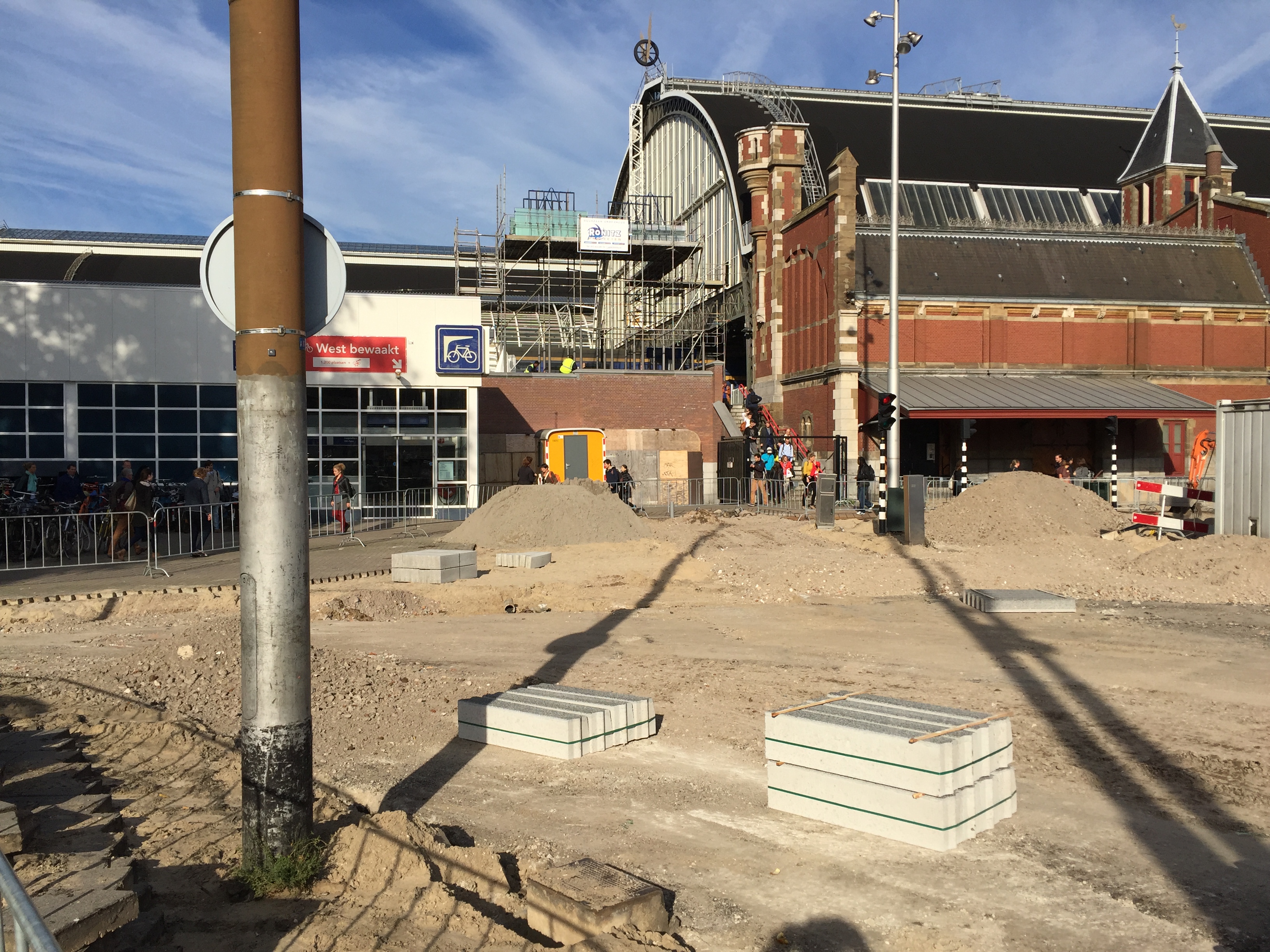
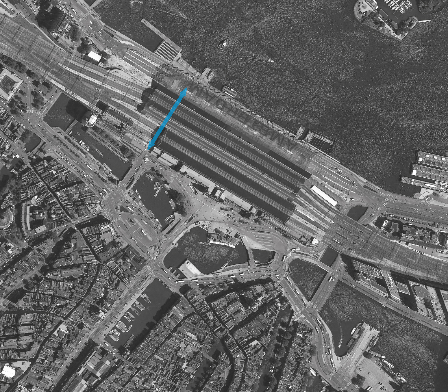
With 162,000 passengers every day and fifteen international railway connections, the Amsterdam Central Station is the second largest in the Netherlands. It is situated between the old centre of the city and the south bank of the IJ River where there is a quay for ferries crossing to Amsterdam North. Opened in 1889, the railway station is one of the country’s most visited heritage buildings. The neo-renaissance vestibule opening out to the city is the work of the architect Pierre Cuypers, who also designed the Rijksmuseum. The roof sheltering the platforms, which are situated along the river bank, is a cast-iron structure forty metres high. For decades, the station’s location parallel to the river and the construction of a highway along the bank complicated the connection between the old city centre and the quay. Cyclists and pedestrians were obliged to go around the building and face heavy traffic, or cross through the bustling vestibule spaces which are full of kiosks, cafeterias and restaurants.Aim of the intervention
Since 1997, the station has been undergoing major renovation work in order to provide platforms for tracks that still do not have them, and to make space for a new underground line crossing the city from north to south. The project aims to transform the station into a major multimodal transport hub which would integrate the old building into a new complex consisting of a city and intercity bus station, the ferry terminal, three underground lines, and footbridges connecting travellers with an existing tunnel for vehicles. In 2008, taking advantage of the scale of the operation, the Amsterdam City Council commissioned the construction of a direct, safe connection overcoming the barriers presented by the station in order to expedite pedestrian and bicycle traffic, which constitutes a very important part of the city’s mobility. This meant adding to the complex work of renovating the station an underground tunnel for slow traffic, a project with a budget of nearly twelve million euros which, open twenty-four hours, would accommodate some 15,000 cyclists every day.Description
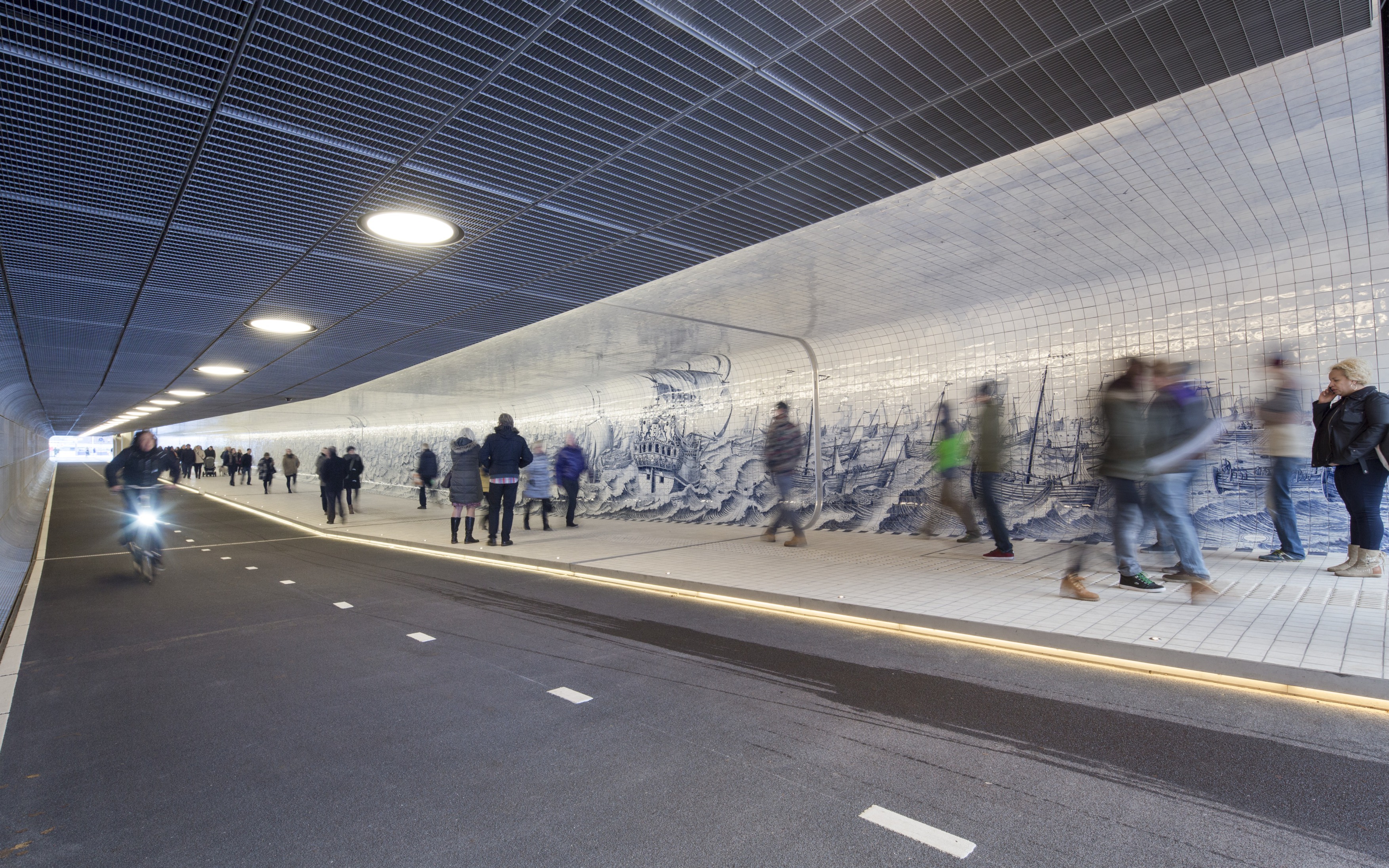
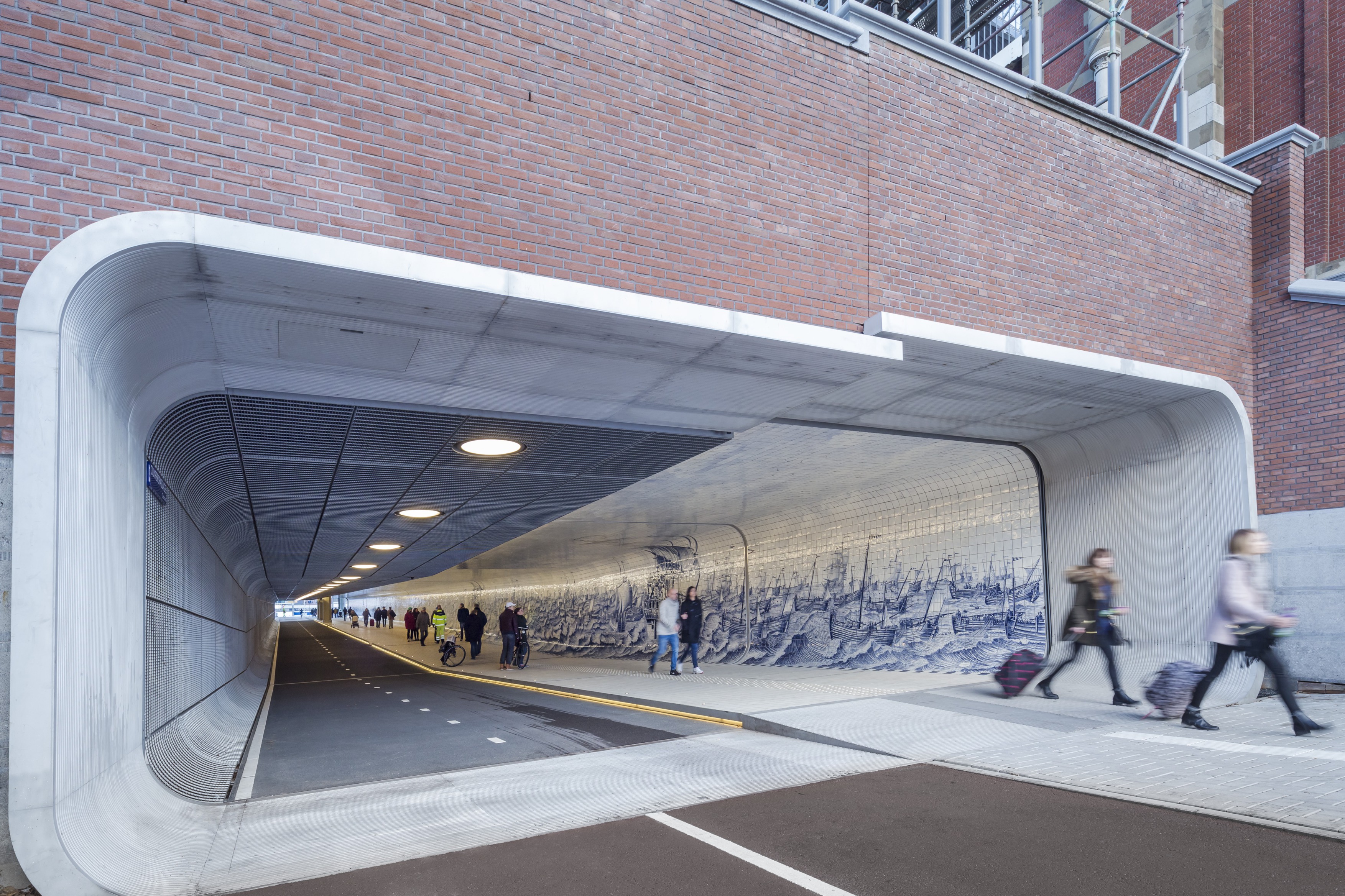
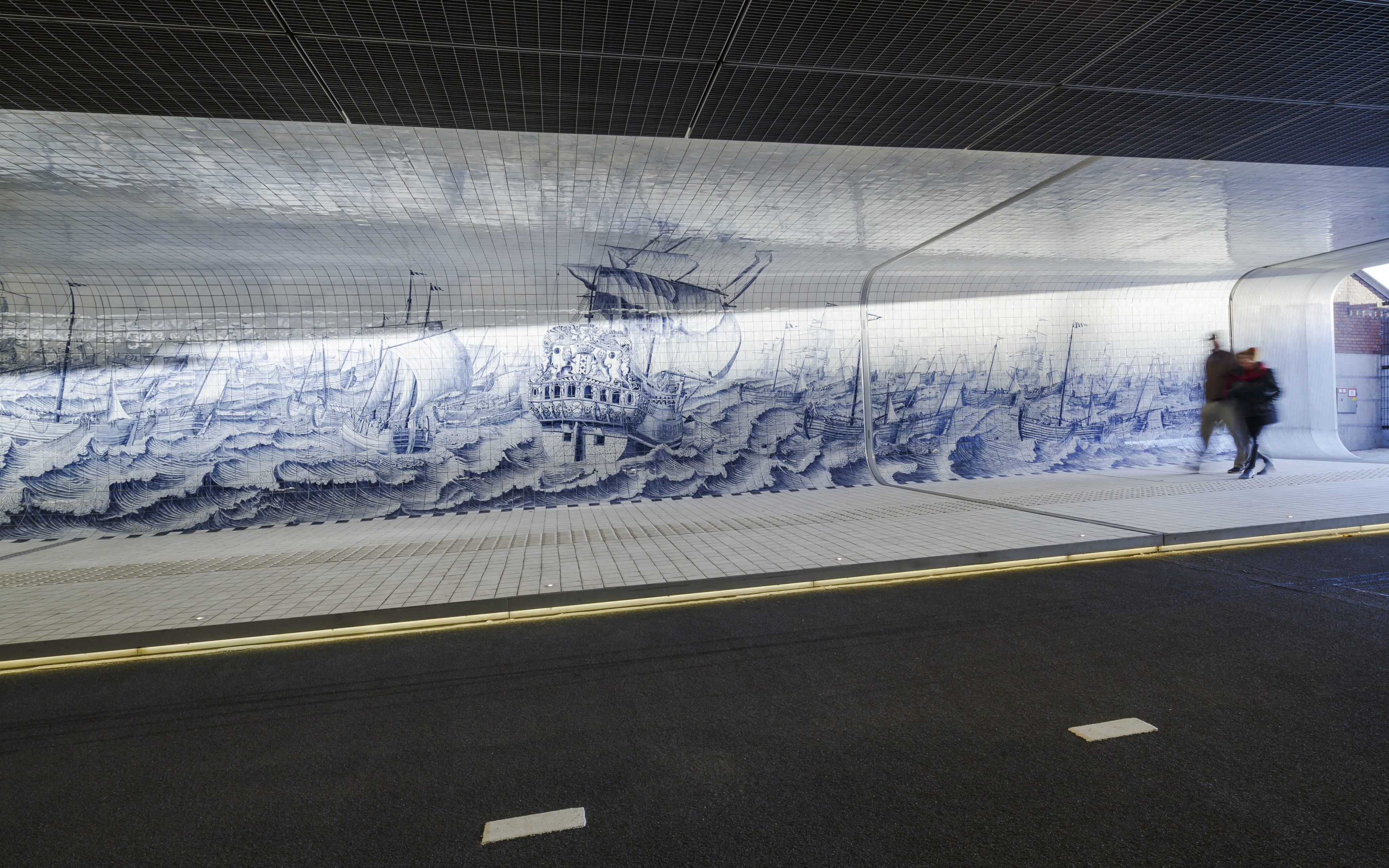
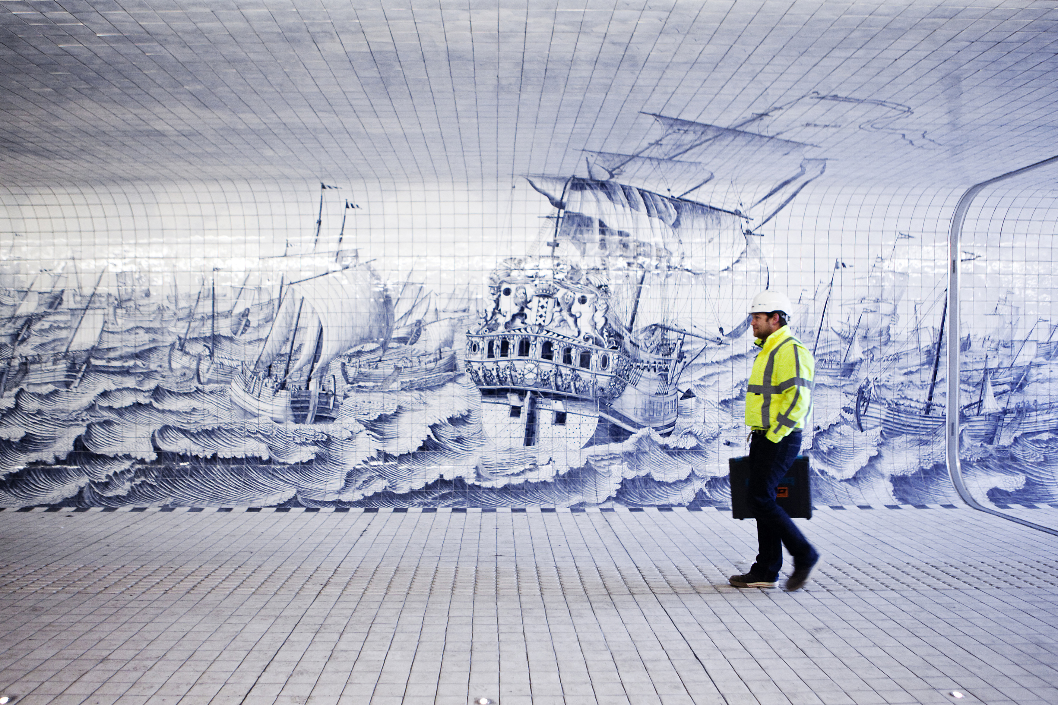
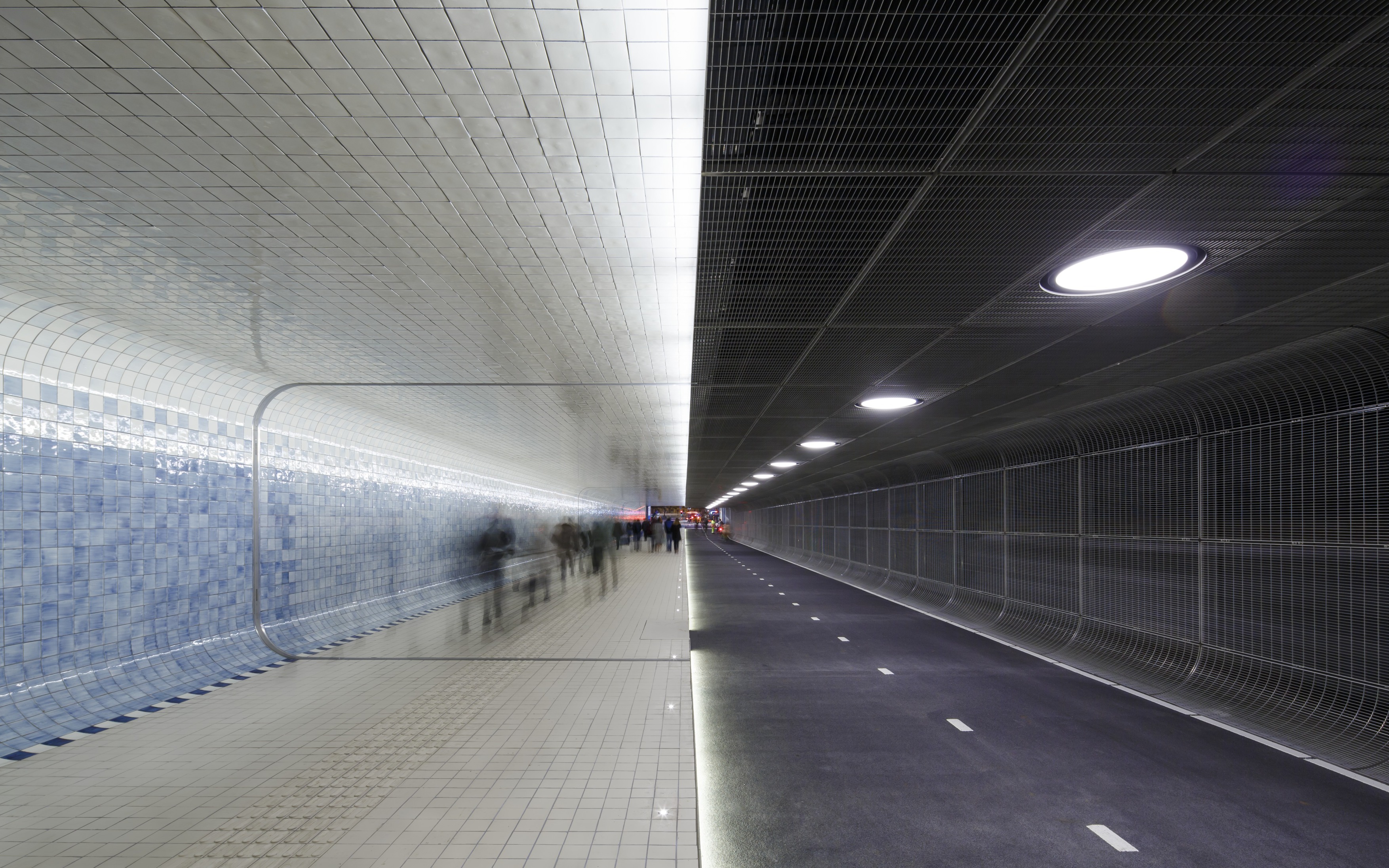
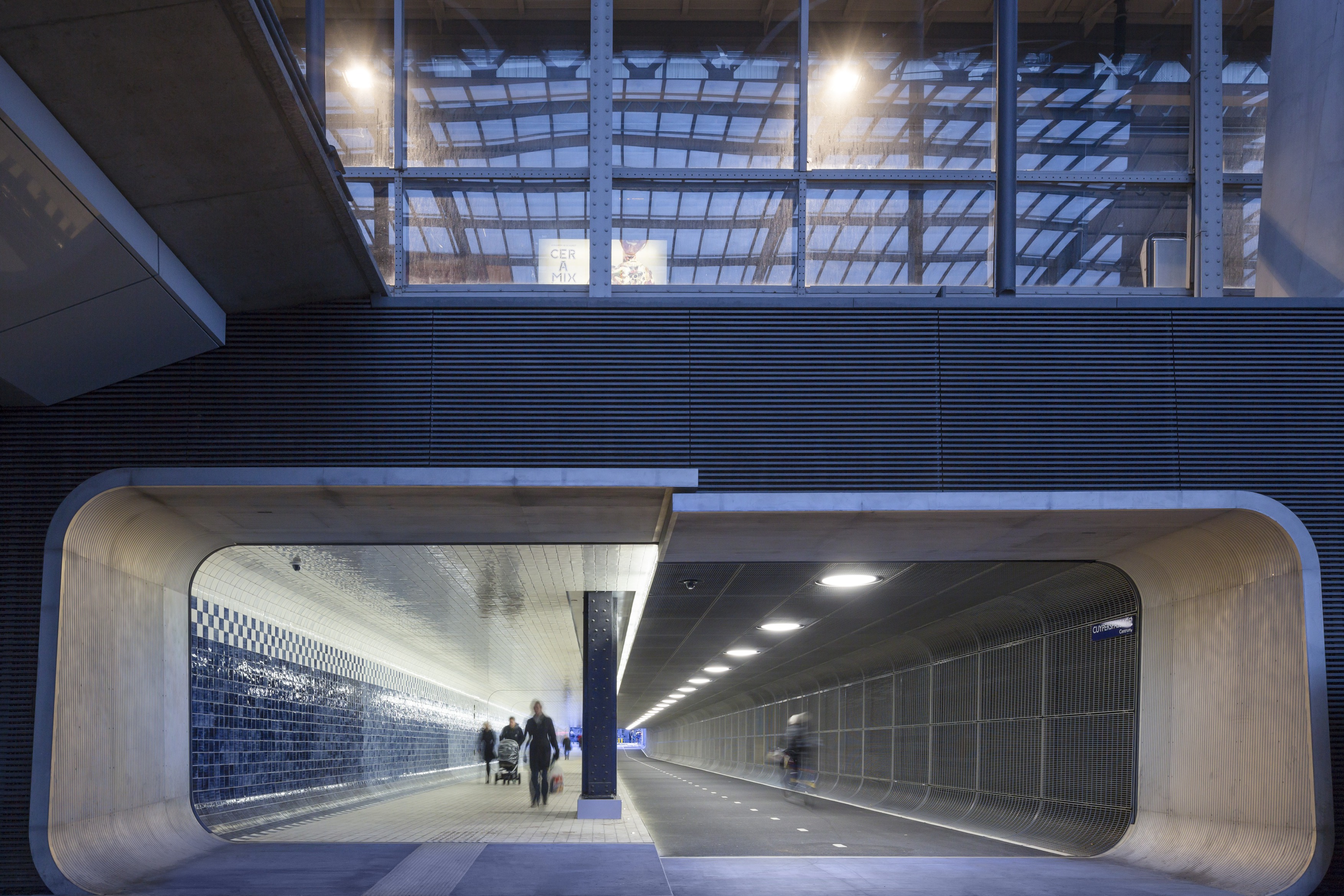
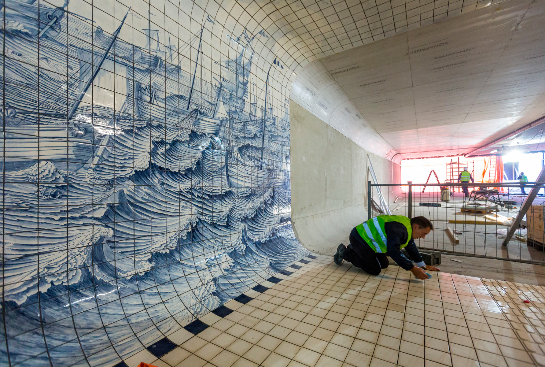
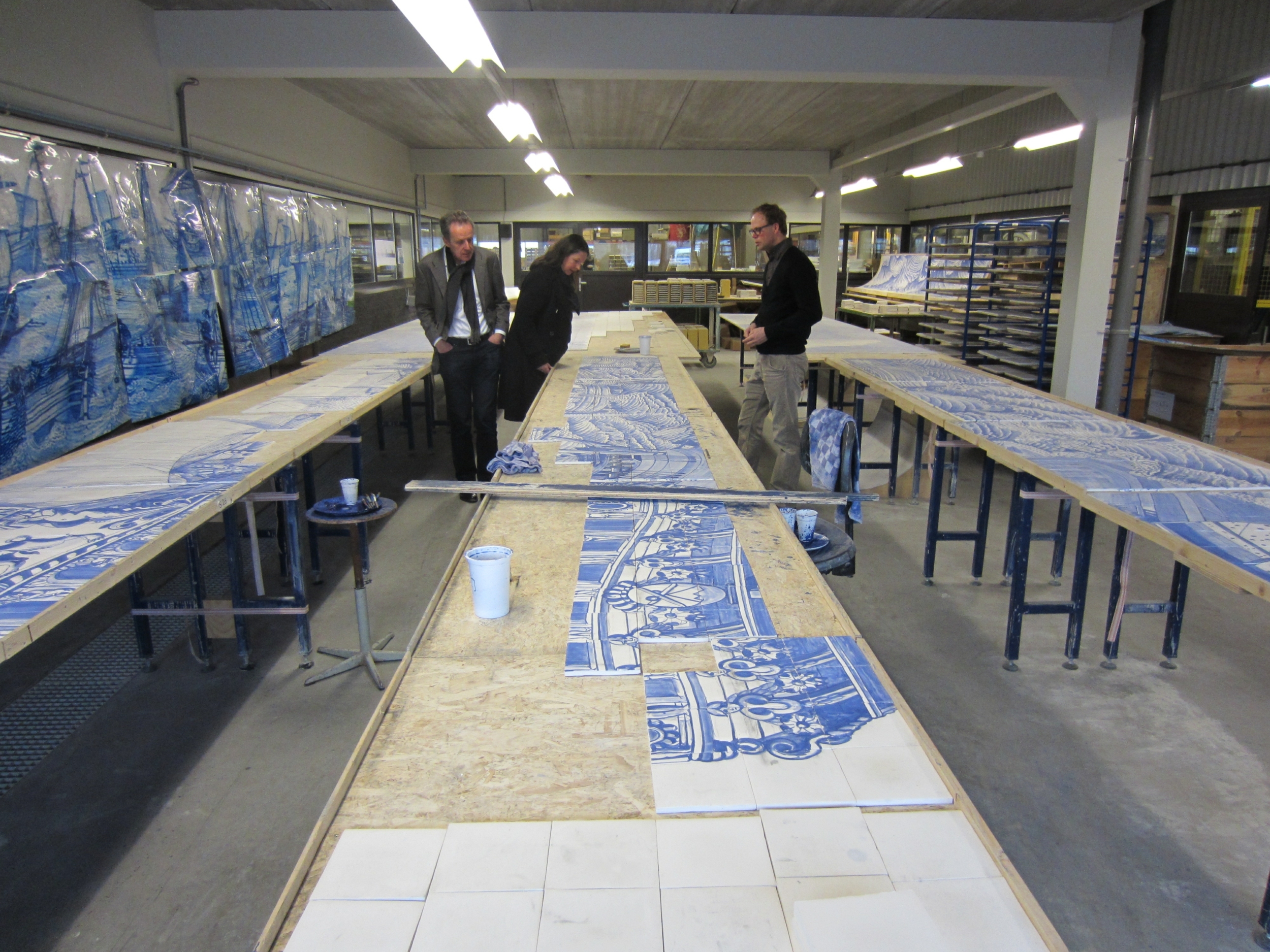
Named “Cuypers Passage” in homage to the designer of the old station, the new underground tunnel is rectilinear in shape, 110 metres long, ten metres wide and three metres high. The tunnel section is divided into two approximately equal halves. One is occupied by a slightly raised footpath for pedestrians where the ground, the side wall and the roof are rounded off in such a way as to create a continuous surface covered with Delft Blue tiles which, forming an artistic mural created by the graphic designer Irma Boom, represent scenes from Dutch naval history. As the tunnel approaches the river, the classical lines of the images dissolve into pixels breaking them down to become an abstract design in colours ranging from sky blue to navy blue. The mural thus suggests movement from the old city to the new developments of Amsterdam North. It took five years for the supplier to produce—manually—the eighty thousand tiles needed for the passageway.The other half of the tunnel is occupied by a two-way cycling track. This has a rougher finish with black, sound-absorbing asphalt. Both the side wall and the ceiling are finished with steel gratings which discourage the hanging of posters and graffiti. Round lights embedded in the false ceiling suggest rhythm as cyclists pass through the tunnel. The raised edge of the footpath separating it from the cycling lane has a continuous strip of LED lamps, throwing ground-level light onto the asphalt.
Assessment
Intensively used all hours of the day, Cuypers Passage is a considerable improvement in the urban infrastructure of a city with such a profusion of bicycles. The tunnel encourages equitable, sustainable mobility by reducing the effort made by pedestrians and cyclists and easing their journey between two essential parts of the city. Unlike many other tunnels, installed with less attention to detail, the interior of this one demonstrates that functional clarity is not incompatible with delicate touches and symbolism. Thanks to the attention given to lighting, acoustics and decoration, it is clean, safe and welcoming. All in all, it is a place of passage with the sensuality of a room in the city. This is especially positive from the gender perspective. All too often women find themselves in unequal, uneasy circumstances because of the insecurity associated with this kind of corridor. Far from wasting money, investing public funds in making such places more people-friendly means democratising public space.PUBLIC SPACE / Cuyperspassage (Amsterdam). Special Mention. European Prize for Urban Public Space 2018 (English with Catalan Subt) from CCCB on Vimeo.
[Last update: 03/09/2019]


